
Sheila Sczepanik
Senior Product Designer
Specializing in enterprise tools, multi-brand design systems, and complex data-dense workflows that scale effortlessly for engineering teams.


CASE STUDY · 2026
Northwestern Medicine — Modernizing patient access and digital care touchpoints
⏰
TL;DR
I hear you, lots going on today. Here’s a quick rundown.

ROLE
Digital Art Director
TIMELINE
2019
TEAM
Core Systems Team (Product, Design, Engineering)
Northwestern Medicine needed to modernize their digital patient experience to eliminate intake drop-off and support over 1M+ active patients. I led the product design strategy to unify fragmented web and mobile touchpoints, translating complex clinical scheduling logic, legacy EHR constraints, and strict HIPAA/WCAG AA compliance into an intuitive, accessible patient portal.
RESEARCH & INFORMATION ARCHITECTURE
Deconstructing patient friction and clinical taxonomy
To modernize the digital care journey, I mapped high-frequency patient workflows against complex clinical requirements. We identified two primary friction points driving portal drop-off: dense medical terminology in search and fragmented post-discovery scheduling.
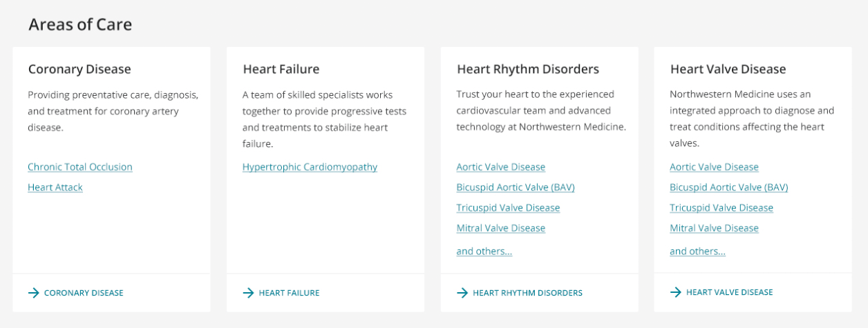
Provider Search & Clinical Taxonomy
Plain-Language Taxonomy
Translated complex clinical taxonomy into patient-centered symptom pathways (e.g., mapping cardiovascular sub-specialties directly to conversational search terms).
Progressive Filtering
Replaced multi-level nested dropdowns with context-aware filters (Location, Insurance, Next Available), reducing search query abandonment.
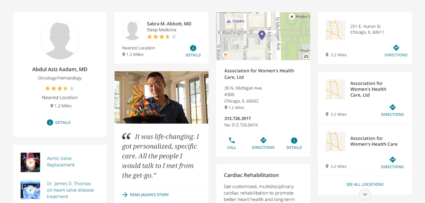
High-Frequency Patient Dashboard
Task-First Architecture
Prioritized top user intents (Book Appointment, View Records, Urgent Care Locations) directly above the fold on mobile and web viewports.
EHR Integration Feasibility
Partnered with engineering and clinical ops to reconcile real-time EHR scheduling constraints with flexible, asynchronous appointment request flows.
Swipe below to see additional screens.
In healthcare, clarity is an emotional need, not just a usability metric.
Patients navigating care portals are frequently stressed or overwhelmed. Replacing dense clinical jargon with symptom-led search and progressive filtering reduced cognitive load, turning a rigid hospital catalog into an intuitive front door for care.
PRODUCTION ARCHITECTURE & PAGE TEMPLATES
Translating clinical excellence into patient conversion
I architected modular, responsive page templates for the "What Makes Us Better" digital initiative on nm.org: balancing clinical authority and U.S. News rankings with friction-free care access pathways (Find a Doctor, Location Finder, and appointment scheduling).
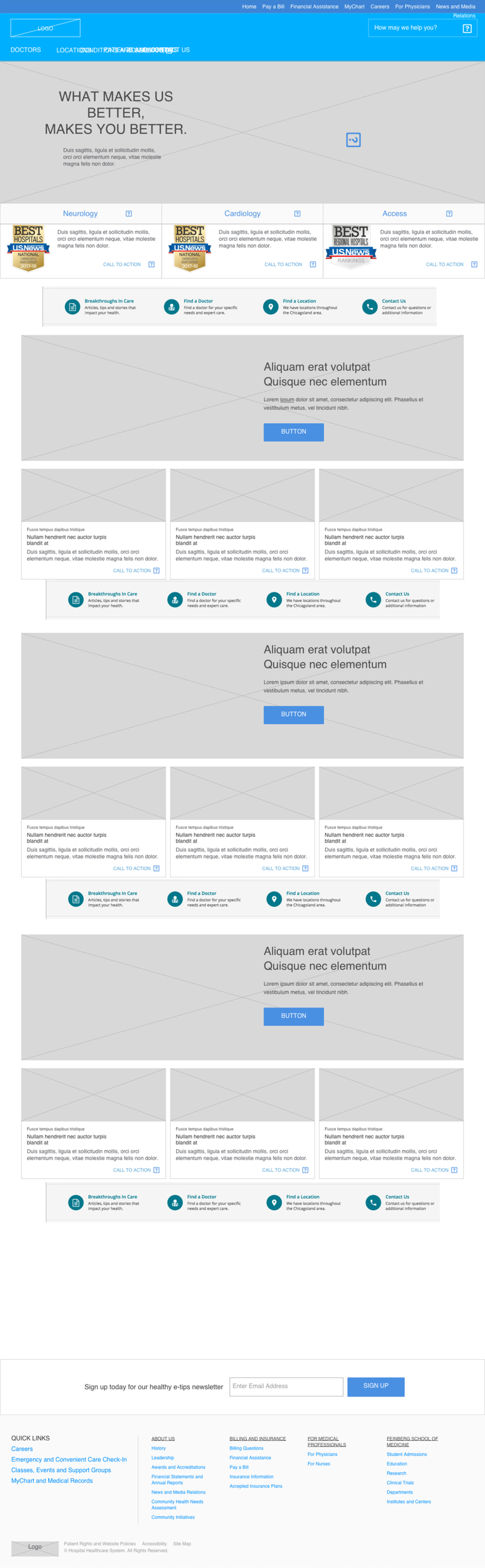
Low-Fidelity Framework & Information Architecture
Rapidly validated content hierarchy and primary care funnels with clinical leadership, locking down navigation and appointment CTAs prior to high-fidelity visual design.
nm.org/better
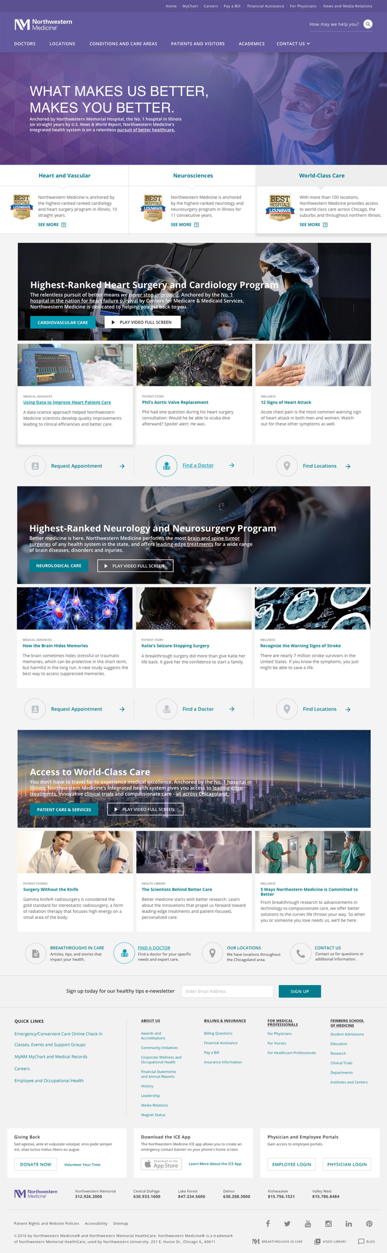
Responsive Campaign Hub
Production-ready template balancing dynamic editorial video modules, specialty care proof points (Cardiology, Neurosciences), and direct appointment onramps.
Modular architecture transforms clinical authority into intuitive care pathways.
Instead of treating healthcare pages as passive brochures, each template was engineered for rapid triage: pairing U.S. News clinical credentials with verified provider search and geolocation tools to convert high-intent visits into confirmed appointments.
UI ARCHITECTURE & INTERACTION MODULES
Crafting high-velocity patient touchpoints
Applying Northwestern Medicine's UI kit, I designed specialized interaction patterns to simplify high-anxiety clinical tasks. Each module balances complex medical data density with accessible touch targets and plain-language wayfinding.
← DRAG OR SCROLL TO EXPLORE (1 OF 4) →
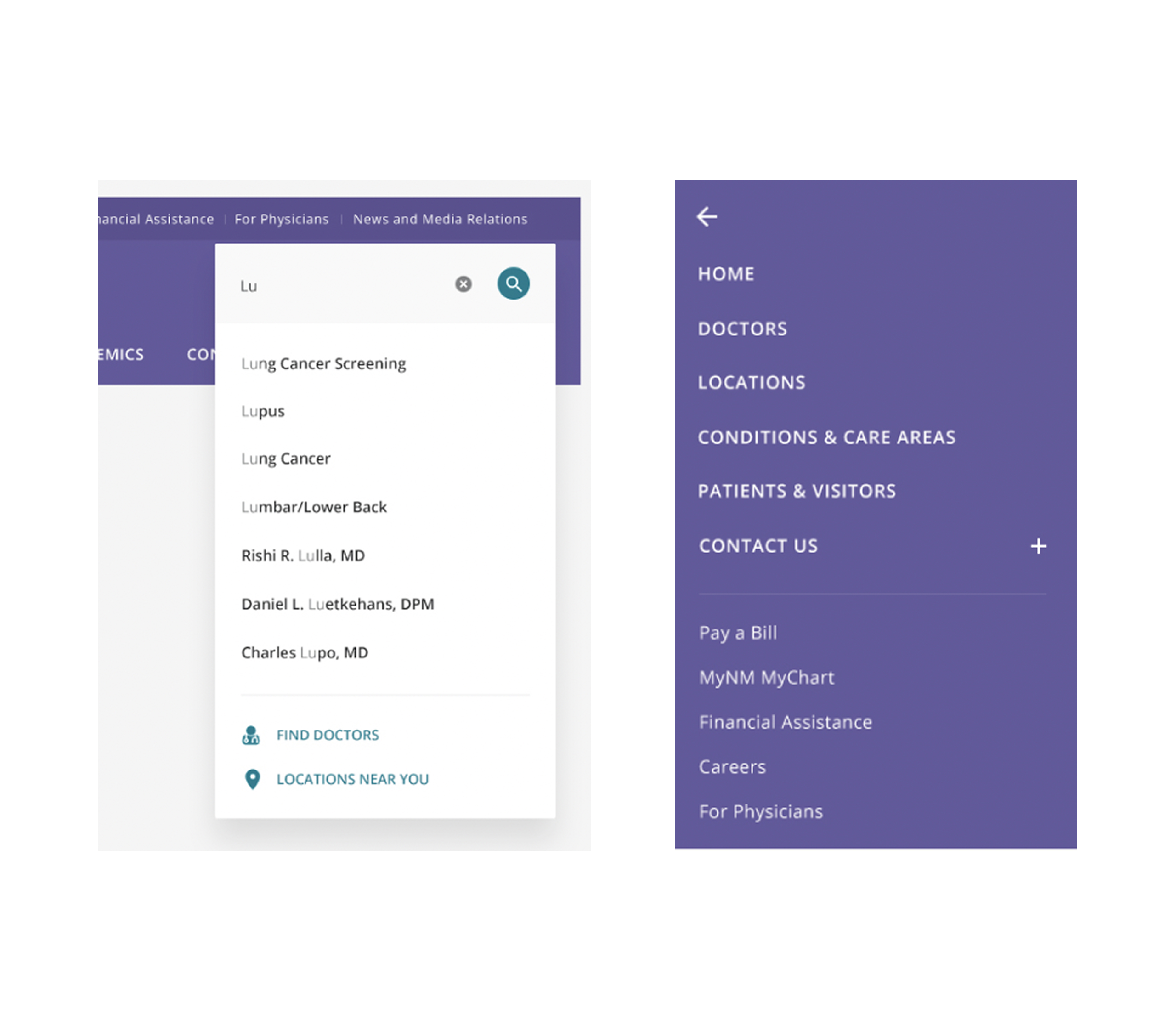
Global Navigation and Predictive Search
Typeahead Wayfinding: Integrated predictive search indexing conditions, doctor names, and clinic locations in real time.
Mobile Triage Drawer: Built a full-height utility drawer prioritizing instant-access actions (Pay a Bill, MyChart, Emergency Triage) above marketing content.
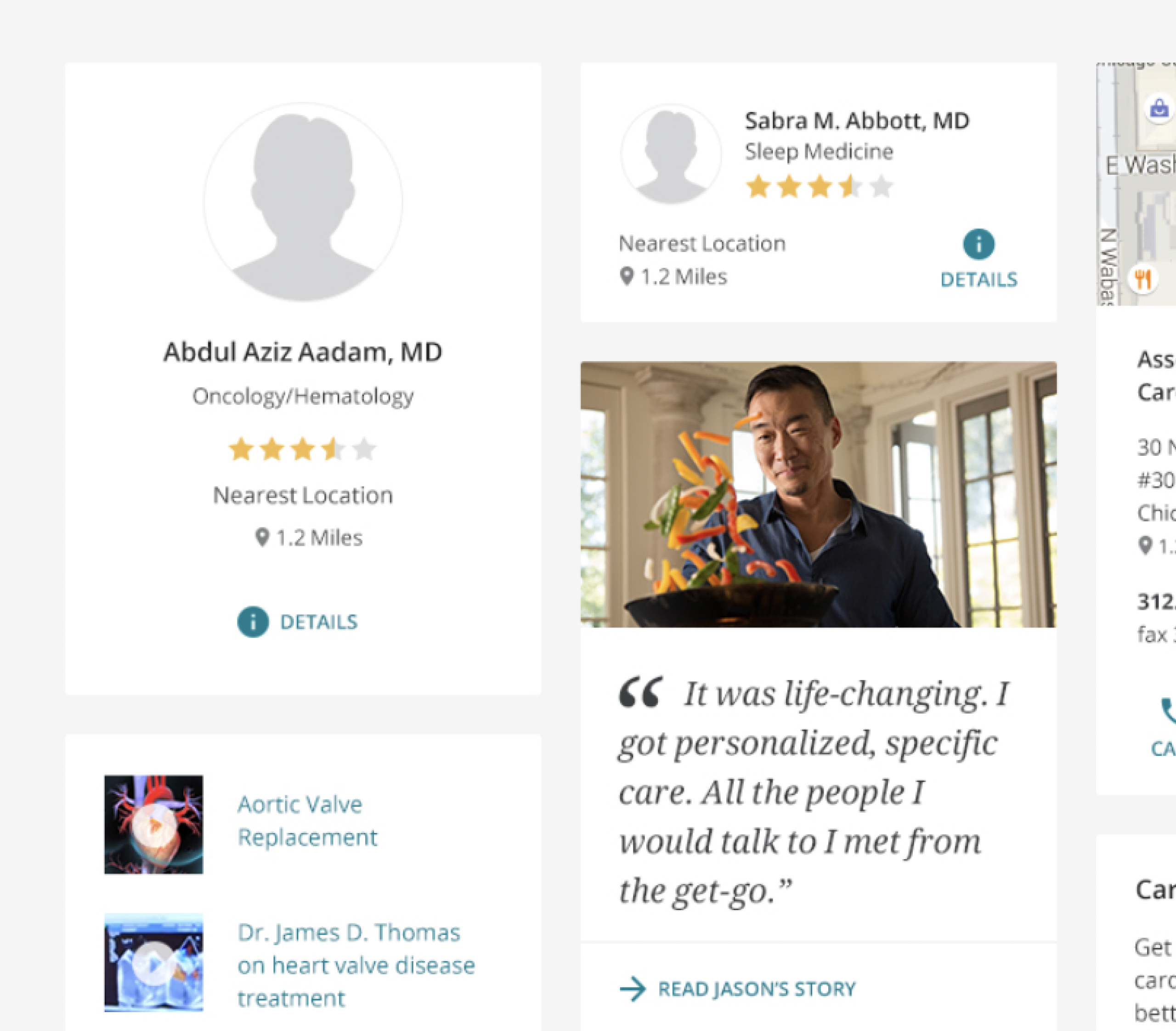
Provider and Specialty Care Cards
At-a-Glance Decision Criteria: Structured cards around core patient selection drivers: clinical specialty, direct distance/proximity, patient ratings, and next available appointment.
Progressive Disclosure: Preserved clear tap targets for secondary actions (viewing credentials and accepted insurance) without cluttering the primary booking trigger.
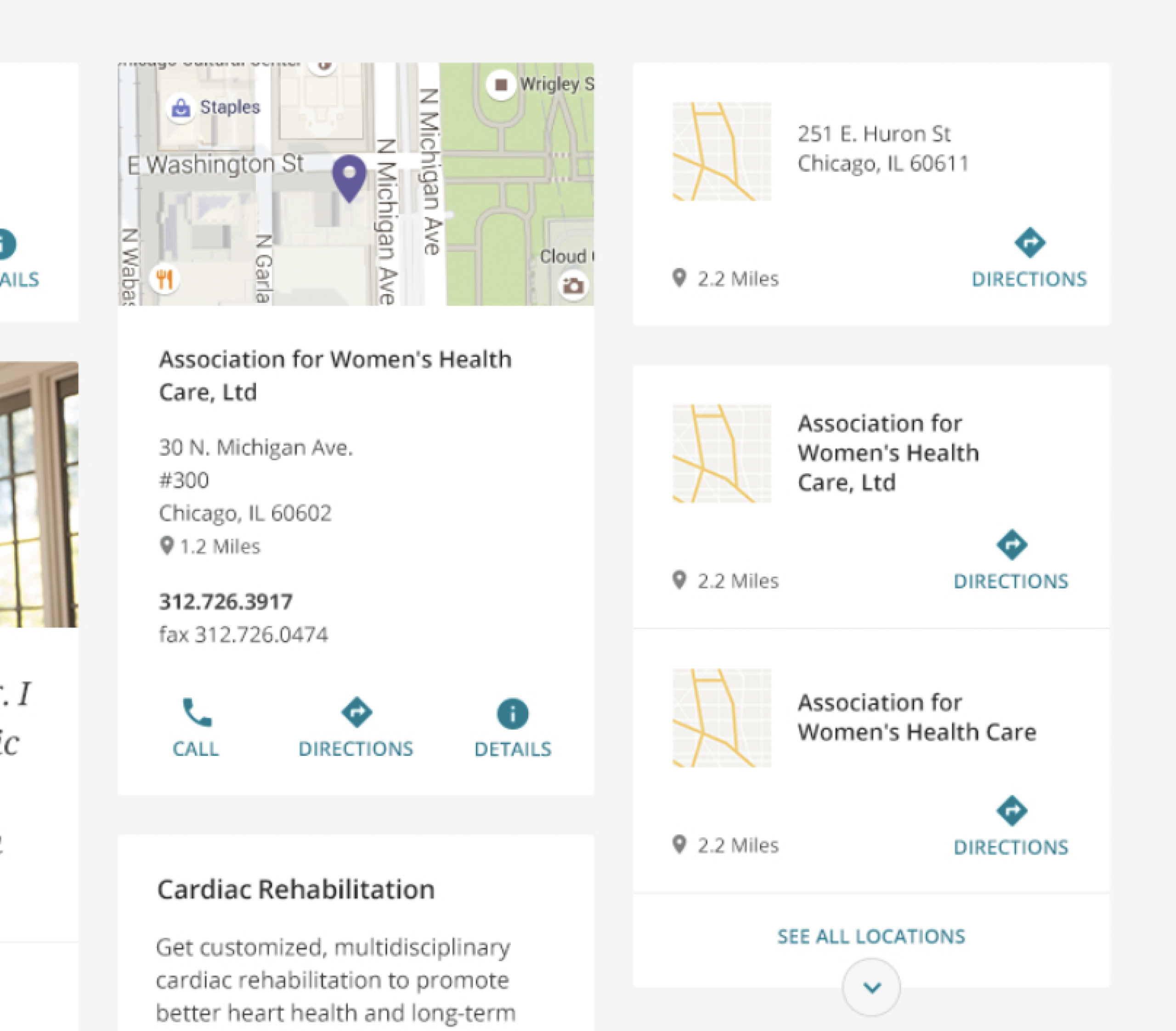
Location Discovery & Direct Contact Modules
Contextual Wayfinding: Paired interactive map snapshots with one-tap native actions (Call Clinic, Get Directions, View Facility Hours).
Clinical Contact & Triage: Prominently surfaced direct emergency hotlines (Call 911 / Nurse Triage) alongside standard appointment inquiry forms.
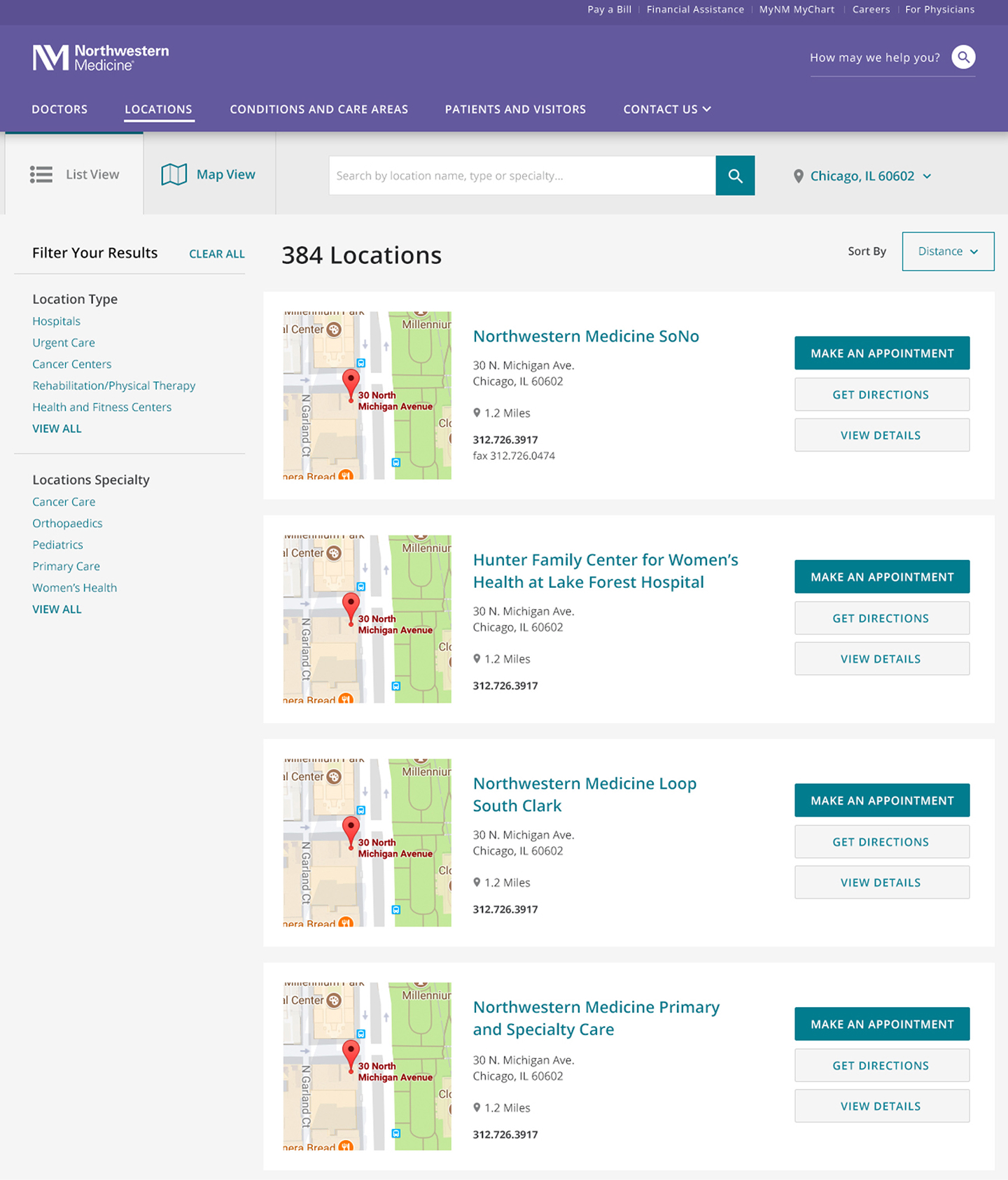
Faceted Care Directory & Filter Architecture
Multi-Attribute Filtering: Structured desktop and mobile filter drawers to narrow 300+ locations by specialty care, hospital network, and immediate walk-in availability.
Synchronized Map Pins: Linked directory search results directly to interactive map pins to streamline geographic decision-making.
FINAL PRODUCTION WORKFLOWS
High-fidelity patient discovery and care navigation
To balance clinical authority with immediate task execution, I structured high-fidelity production templates around distinct patient mindsets: urgent location triage and informed specialty care discovery.
Workflow 01: Specialized Care & Clinical Authority
Clinical Authority Proof Points
Integrated top-tier national rankings (Heart & Vascular, Neurosciences) and institutional trust badges directly below the hero statement to establish immediate clinical credibility.
Direct Intake CTAs
Integrated persistent, high-visibility action trays (Request Appointment, Find a Doctor, Find Locations) anchored beneath condition education modules to streamline patient intake.
Accessible Contrast Over Media
Engineered tinted backdrop overlays to guarantee WCAG AA text contrast across rich clinical video reels, background photography, and editorial patient stories.
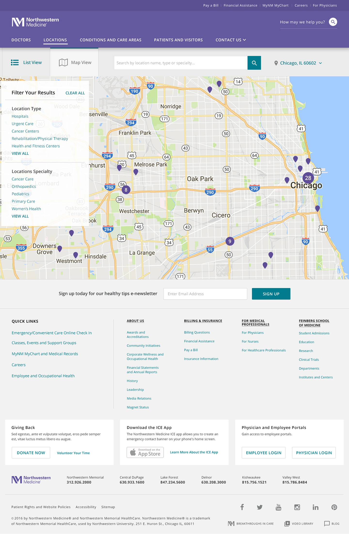
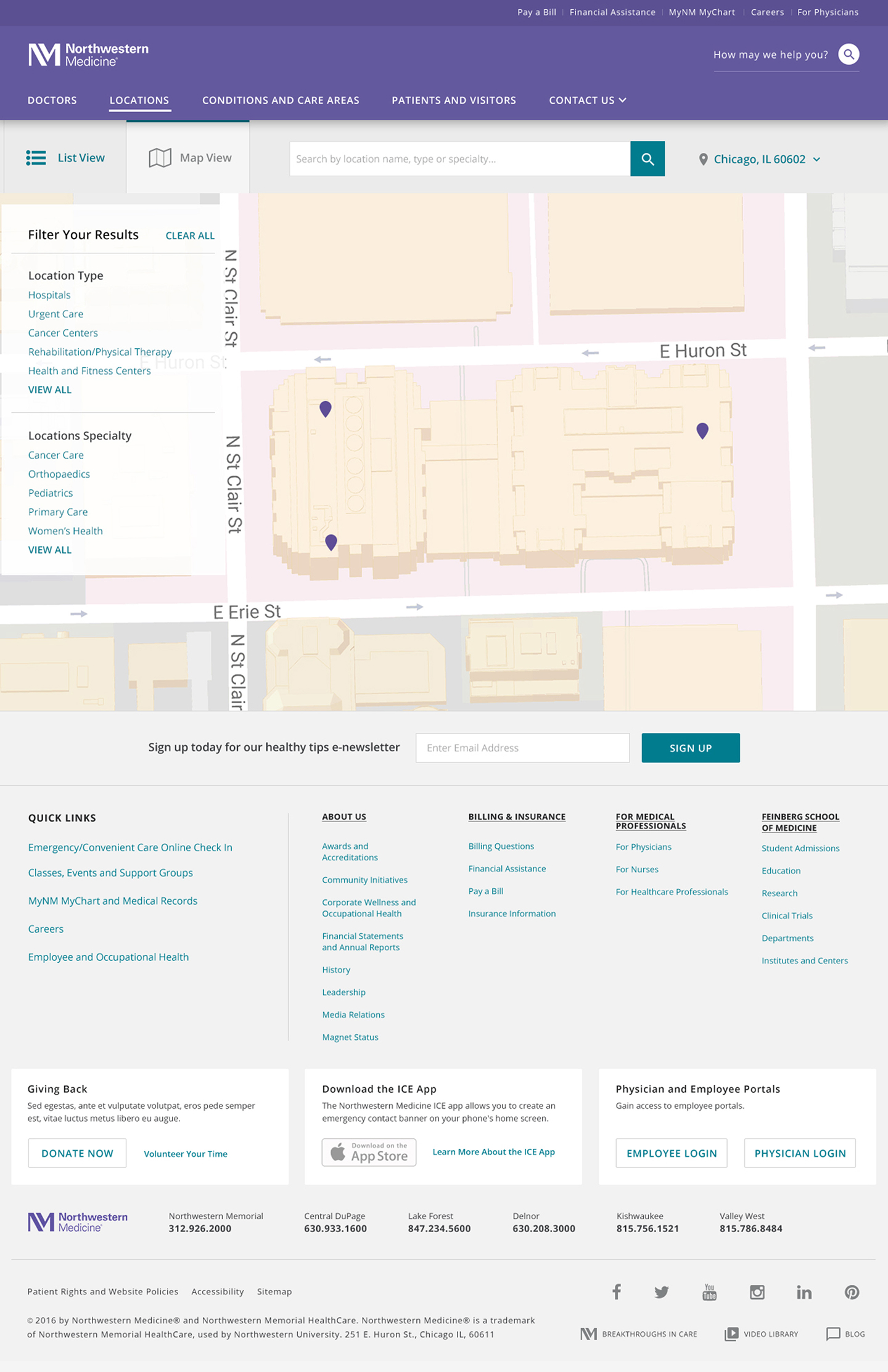
Workflow 02: Geolocation, Mapping & Facility Discovery
Regional Pin Clustering
Interactive regional mapping engineered to cluster 380+ care sites across Chicagoland without visual lag, enabling patients to orient nearby immediate care, outpatient clinics, and major hospitals at a glance.
Campus Micro-Wayfinding
Engineered high-zoom architectural footprint views to reduce patient anxiety in complex medical districts, highlighting pavilion entries, accessible parking structures, and dedicated drop-off zones.
Dual List-and-Map Parity
Synchronized faceted directory search with dynamic map bounds, displaying real-time clinical filters, driving times, and direct booking CTAs without triggering page reloads.
MOBILE RESPONSIVENESS & ACCESSIBILITY
Optimizing touch-first triage and mobile care access
Over 60% of patient discovery sessions originated on mobile devices during acute care needs. I architected the responsive mobile layout to prioritize immediate appointment triage, location lookups, and clear typography while maintaining strict WCAG AA tap targets.
Scroll Down

Thumb-Zone Architecture & Triage
Primary Task Anchoring
Positioned top care actions (Request Appointment, Find a Doctor, Find Locations) within natural thumb-reach zones to eliminate reach fatigue.
Persistent Utility Navigation
Compressed complex multi-tier desktop menus into a streamlined drawer and sticky search bar for fast emergency wayfinding.
Low-Vision & Motor Usability Standards
Enlarged Touch Boundaries
Enforced minimum 48x48px hit areas across all interactive buttons, cards, and accordion toggles to support elderly patient demographics.
Responsive Type Scaling
Structured fluid type scales and high-contrast boundaries to ensure legible hierarchy across breakpoints without horizontal clipping or truncation.
Designing for healthcare means designing for high-anxiety moments.
Patients accessing clinical portals on mobile are frequently in transit, stressed, or managing urgent family needs. Prioritizing thumb-zone wayfinding, generous touch targets, and unambiguous care CTAs eliminates cognitive overload when clarity matters most.
REFLECTIONS & FUTURE STATE
Measurable Impact and Strategic Takeaways
01. Conversion and Care Intake
Task Speed & Clarity: Reduced multi-step booking friction by anchoring one-tap appointment triggers and plain-language condition search across 12 primary service lines.
Drop-Off Reduction: Eliminated nested dropdown menus in favor of contextual filtering, drastically reducing search abandonment.
02. 100% WCAG AA Compliance
Task Speed & Clarity: Reduced multi-step booking friction by anchoring one-tap appointment triggers and plain-language condition search across 12 primary service lines.
Drop-Off Reduction: Eliminated nested dropdown menus in favor of contextual filtering, drastically reducing search abandonment.
03. Evidence-Based Design Leadership
Testing Over Assumption: Partnered with researchers and engineering leads early to validate interactive prototypes against real clinical workflows and backend EHR data constraints.
Enterprise Kit Scalability: Applied Northwestern Medicine's UI kit across complex clinical modules without creating one-off design inconsistencies.
NEXT PROJECT
Epsilon →

Sheila Sczepanik
Senior Product Designer
Specializing in enterprise tools, multi-brand design systems, and complex data-dense workflows that scale effortlessly for engineering teams.
CASE STUDY · 2026
Northwestern Medicine — Modernizing patient access and digital care touchpoints
⏰
TL;DR
I hear you, lots going on today. Here’s a quick rundown.
ROLE
Digital Art Director
TIMELINE
2019
TEAM
Core Systems Team (Product, Design, Engineering)
Northwestern Medicine needed to modernize their digital patient experience to eliminate intake drop-off and support over 1M+ active patients. I led the product design strategy to unify fragmented web and mobile touchpoints, translating complex clinical scheduling logic, legacy EHR constraints, and strict HIPAA/WCAG AA compliance into an intuitive, accessible patient portal.
RESEARCH & INFORMATION ARCHITECTURE
Deconstructing patient friction and clinical taxonomy
To modernize the digital care journey, I mapped high-frequency patient workflows against complex clinical requirements. We identified two primary friction points driving portal drop-off: dense medical terminology in search and fragmented post-discovery scheduling.
Provider Search & Clinical Taxonomy
Plain-Language Taxonomy
Translated complex clinical taxonomy into patient-centered symptom pathways (e.g., mapping cardiovascular sub-specialties directly to conversational search terms).
Progressive Filtering
Replaced multi-level nested dropdowns with context-aware filters (Location, Insurance, Next Available), reducing search query abandonment.
High-Frequency Patient Dashboard
Task-First Architecture
Prioritized top user intents (Book Appointment, View Records, Urgent Care Locations) directly above the fold on mobile and web viewports.
EHR Integration Feasibility
Partnered with engineering and clinical ops to reconcile real-time EHR scheduling constraints with flexible, asynchronous appointment request flows.
In healthcare, clarity is an emotional need, not just a usability metric.
Patients navigating care portals are frequently stressed or overwhelmed. Replacing dense clinical jargon with symptom-led search and progressive filtering reduced cognitive load, turning a rigid hospital catalog into an intuitive front door for care.
PRODUCTION ARCHITECTURE & PAGE TEMPLATES
Translating clinical excellence into patient conversion
I architected modular, responsive page templates for the "What Makes Us Better" digital initiative on nm.org: balancing clinical authority and U.S. News rankings with friction-free care access pathways (Find a Doctor, Location Finder, and appointment scheduling).
Low-Fidelity Framework & Information Architecture
Rapidly validated content hierarchy and primary care funnels with clinical leadership, locking down navigation and appointment CTAs prior to high-fidelity visual design.
nm.org/better
Responsive Campaign Hub
Production-ready template balancing dynamic editorial video modules, specialty care proof points (Cardiology, Neurosciences), and direct appointment onramps.
Modular architecture transforms clinical authority into intuitive care pathways.
Instead of treating healthcare pages as passive brochures, each template was engineered for rapid triage: pairing U.S. News clinical credentials with verified provider search and geolocation tools to convert high-intent visits into confirmed appointments.
UI ARCHITECTURE & INTERACTION MODULES
Crafting high-velocity patient touchpoints
Applying Northwestern Medicine's UI kit, I designed specialized interaction patterns to simplify high-anxiety clinical tasks. Each module balances complex medical data density with accessible touch targets and plain-language wayfinding.
← DRAG OR SCROLL TO EXPLORE (1 OF 3) →
Global Navigation and Predictive Search
Typeahead Wayfinding: Integrated predictive search indexing conditions, doctor names, and clinic locations in real time.
Mobile Triage Drawer: Built a full-height utility drawer prioritizing instant-access actions (Pay a Bill, MyChart, Emergency Triage) above marketing content.
Provider and Specialty Care Cards
At-a-Glance Decision Criteria: Structured cards around core patient selection drivers: clinical specialty, direct distance/proximity, patient ratings, and next available appointment.
Progressive Disclosure: Preserved clear tap targets for secondary actions (viewing credentials and accepted insurance) without cluttering the primary booking trigger.
Location Discovery & Direct Contact Modules
Contextual Wayfinding: Paired interactive map snapshots with one-tap native actions (Call Clinic, Get Directions, View Facility Hours).
Clinical Contact & Triage: Prominently surfaced direct emergency hotlines (Call 911 / Nurse Triage) alongside standard appointment inquiry forms.
Faceted Care Directory & Filter Architecture
Multi-Attribute Filtering: Structured desktop and mobile filter drawers to narrow 300+ locations by specialty care, hospital network, and immediate walk-in availability.
Synchronized Map Pins: Linked directory search results directly to interactive map pins to streamline geographic decision-making.
FINAL PRODUCTION WORKFLOWS
High-fidelity patient discovery and care navigation
To balance clinical authority with immediate task execution, I structured high-fidelity production templates around distinct patient mindsets: urgent location triage and informed specialty care discovery.
Workflow 01: Specialized Care & Clinical Authority
Clinical Authority Proof Points
Integrated top-tier national rankings (Heart & Vascular, Neurosciences) and institutional trust badges directly below the hero statement to establish immediate clinical credibility.
Direct Intake CTAs
Integrated persistent, high-visibility action trays (Request Appointment, Find a Doctor, Find Locations) anchored beneath condition education modules to streamline patient intake.
Accessible Contrast Over Media
Engineered tinted backdrop overlays to guarantee WCAG AA text contrast across rich clinical video reels, background photography, and editorial patient stories.
Workflow 02: Geolocation, Mapping & Facility Discovery
Regional Pin Clustering
Interactive regional mapping engineered to cluster 380+ care sites across Chicagoland without visual lag, enabling patients to orient nearby immediate care, outpatient clinics, and major hospitals at a glance.
Campus Micro-Wayfinding
Engineered high-zoom architectural footprint views to reduce patient anxiety in complex medical districts, highlighting pavilion entries, accessible parking structures, and dedicated drop-off zones.
Dual List-and-Map Parity
Synchronized faceted directory search with dynamic map bounds, displaying real-time clinical filters, driving times, and direct booking CTAs without triggering page reloads.
MOBILE RESPONSIVENESS & ACCESSIBILITY
Optimizing touch-first triage and mobile care access
Over 60% of patient discovery sessions originated on mobile devices during acute care needs. I architected the responsive mobile layout to prioritize immediate appointment triage, location lookups, and clear typography while maintaining strict WCAG AA tap targets.
Scroll Down
Thumb-Zone Architecture & Triage
Primary Task Anchoring
Positioned top care actions (Request Appointment, Find a Doctor, Find Locations) within natural thumb-reach zones to eliminate reach fatigue.
Persistent Utility Navigation
Compressed complex multi-tier desktop menus into a streamlined drawer and sticky search bar for fast emergency wayfinding.
Low-Vision & Motor Usability Standards
Enlarged Touch Boundaries
Enforced minimum 48x48px hit areas across all interactive buttons, cards, and accordion toggles to support elderly patient demographics.
Responsive Type Scaling
Structured fluid type scales and high-contrast boundaries to ensure legible hierarchy across breakpoints without horizontal clipping or truncation.
Designing for healthcare means designing for high-anxiety moments.
Patients accessing clinical portals on mobile are frequently in transit, stressed, or managing urgent family needs. Prioritizing thumb-zone wayfinding, generous touch targets, and unambiguous care CTAs eliminates cognitive overload when clarity matters most.
REFLECTIONS & FUTURE STATE
Measurable Impact and Strategic Takeaways
02. 100% WCAG AA Compliance
Task Speed & Clarity: Reduced multi-step booking friction by anchoring one-tap appointment triggers and plain-language condition search across 12 primary service lines.
Drop-Off Reduction: Eliminated nested dropdown menus in favor of contextual filtering, drastically reducing search abandonment.
03. Evidence-Based Design Leadership
Testing Over Assumption: Partnered with researchers and engineering leads early to validate interactive prototypes against real clinical workflows and backend EHR data constraints.
Enterprise Kit Scalability: Applied Northwestern Medicine's UI kit across complex clinical modules without creating one-off design inconsistencies.
Sheila Sczepanik
Senior Product Designer
Specializing in enterprise tools, multi-brand design systems, and complex data-dense workflows that scale effortlessly for engineering teams.
CASE STUDY · HEALTHCARE & ENTERPRISE PORTALS
Northwestern Medicine — Modernizing patient access and digital care touchpoints
⏰
TL;DR
I hear you, lots going on today. Here’s a quick rundown.
ROLE
Digital Art Director
TIMELINE
2019
TEAM
Core Systems Team (Product, Design, Engineering)
Northwestern Medicine needed to modernize their digital patient experience to eliminate intake drop-off and support over 1M+ active patients. I led the product design strategy to unify fragmented web and mobile touchpoints, translating complex clinical scheduling logic, legacy EHR constraints, and strict HIPAA/WCAG AA compliance into an intuitive, accessible patient portal.
RESEARCH & INFORMATION ARCHITECTURE
Deconstructing patient friction and clinical taxonomy
To modernize the digital care journey, I mapped high-frequency patient workflows against complex clinical requirements. We identified two primary friction points driving portal drop-off: dense medical terminology in search and fragmented post-discovery scheduling.
Provider Search & Clinical Taxonomy
Plain-Language Taxonomy
Translated complex clinical taxonomy into patient-centered symptom pathways (e.g., mapping cardiovascular sub-specialties directly to conversational search terms).
Progressive Filtering
Replaced multi-level nested dropdowns with context-aware filters (Location, Insurance, Next Available), reducing search query abandonment.
High-Frequency Patient Dashboard
Task-First Architecture
Prioritized top user intents (Book Appointment, View Records, Urgent Care Locations) directly above the fold on mobile and web viewports.
EHR Integration Feasibility
Partnered with engineering and clinical ops to reconcile real-time EHR scheduling constraints with flexible, asynchronous appointment request flows.
In healthcare, clarity is an emotional need, not just a usability metric.
Patients navigating care portals are frequently stressed or overwhelmed. Replacing dense clinical jargon with symptom-led search and progressive filtering reduced cognitive load, turning a rigid hospital catalog into an intuitive front door for care.
PRODUCTION ARCHITECTURE & PAGE TEMPLATES
Translating clinical excellence into patient conversion
I architected modular, responsive page templates for the "What Makes Us Better" digital initiative on nm.org: balancing clinical authority and U.S. News rankings with friction-free care access pathways (Find a Doctor, Location Finder, and appointment scheduling).
Low-Fidelity Framework & Information Architecture
Rapidly validated content hierarchy and primary care funnels with clinical leadership, locking down navigation and appointment CTAs prior to high-fidelity visual design.
nm.org/better
Responsive Campaign Hub
Production-ready template balancing dynamic editorial video modules, specialty care proof points (Cardiology, Neurosciences), and direct appointment onramps.
← DRAG OR SCROLL TO EXPLORE (1 OF 3) →
VIEW 01
Location Search
Multi-variable faceted search allowing patients to filter 380+ clinical sites by care type, specialty, and proximity, paired with direct booking CTAs and distance markers.
VIEW 02
Location and Clinic Directory
Clustered regional mapping paired with progressive filters for facility type, clinical specialty, and urgent care availability across the broader network.
VIEW 03
Urban Campus Micro-Wayfinding
High-density, building-level street mapping designed to de-stress campus navigation—guiding patients directly to complex pavilion entrances, parking garages, and dedicated clinic drop-offs.
Modular architecture transforms clinical authority into intuitive care pathways.
Instead of treating healthcare pages as passive brochures, each template was engineered for rapid triage: pairing U.S. News clinical credentials with verified provider search and geolocation tools to convert high-intent visits into confirmed appointments.
UI ARCHITECTURE & INTERACTION MODULES
Crafting high-velocity patient touchpoints
Applying Northwestern Medicine's UI kit, I designed specialized interaction patterns to simplify high-anxiety clinical tasks. Each module balances complex medical data density with accessible touch targets and plain-language wayfinding.
← DRAG OR SCROLL TO EXPLORE (1 OF 3) →
Global Navigation and Predictive Search
Typeahead Wayfinding: Integrated predictive search indexing conditions, doctor names, and clinic locations in real time.
Mobile Triage Drawer: Built a full-height utility drawer prioritizing instant-access actions (Pay a Bill, MyChart, Emergency Triage) above marketing content.
Provider and Specialty Care Cards
At-a-Glance Decision Criteria: Structured cards around core patient selection drivers: clinical specialty, direct distance/proximity, patient ratings, and next available appointment.
Progressive Disclosure: Preserved clear tap targets for secondary actions (viewing credentials and accepted insurance) without cluttering the primary booking trigger.
Location Discovery & Direct Contact Modules
Contextual Wayfinding: Paired interactive map snapshots with one-tap native actions (Call Clinic, Get Directions, View Facility Hours).
Clinical Contact & Triage: Prominently surfaced direct emergency hotlines (Call 911 / Nurse Triage) alongside standard appointment inquiry forms.
Faceted Care Directory & Filter Architecture
Multi-Attribute Filtering: Structured desktop and mobile filter drawers to narrow 300+ locations by specialty care, hospital network, and immediate walk-in availability.
Synchronized Map Pins: Linked directory search results directly to interactive map pins to streamline geographic decision-making.
FINAL PRODUCTION WORKFLOWS
High-fidelity patient discovery and care navigation
To balance clinical authority with immediate task execution, I structured high-fidelity production templates around distinct patient mindsets: urgent location triage and informed specialty care discovery.
Workflow 01: Specialized Care & Clinical Authority
Clinical Authority Proof Points
Integrated top-tier national rankings (Heart & Vascular, Neurosciences) and institutional trust badges directly below the hero statement to establish immediate clinical credibility.
Direct Intake CTAs
Integrated persistent, high-visibility action trays (Request Appointment, Find a Doctor, Find Locations) anchored beneath condition education modules to streamline patient intake.
Accessible Contrast Over Media
Engineered tinted backdrop overlays to guarantee WCAG AA text contrast across rich clinical video reels, background photography, and editorial patient stories.
Workflow 02: Geolocation, Mapping & Facility Discovery
Regional Pin Clustering
Interactive regional mapping engineered to cluster 380+ care sites across Chicagoland without visual lag, enabling patients to orient nearby immediate care, outpatient clinics, and major hospitals at a glance.
Campus Micro-Wayfinding
Engineered high-zoom architectural footprint views to reduce patient anxiety in complex medical districts, highlighting pavilion entries, accessible parking structures, and dedicated drop-off zones.
Dual List-and-Map Parity
Synchronized faceted directory search with dynamic map bounds, displaying real-time clinical filters, driving times, and direct booking CTAs without triggering page reloads.
MOBILE RESPONSIVENESS & ACCESSIBILITY
Optimizing touch-first triage and mobile care access
Over 60% of patient discovery sessions originated on mobile devices during acute care needs. I architected the responsive mobile layout to prioritize immediate appointment triage, location lookups, and clear typography while maintaining strict WCAG 2.1 AA accessibility standards.
Scroll Down
Thumb-Zone Architecture & Triage
Primary Task Anchoring
Positioned top care actions (Request Appointment, Find a Doctor, Find Locations) within natural thumb-reach zones to eliminate reach fatigue.
Persistent Utility Navigation
Compressed complex multi-tier desktop menus into a streamlined drawer and sticky search bar for fast emergency wayfinding.
Low-Vision & Motor Usability Standards
Enlarged Touch Boundaries
Enforced minimum 48×48px interactive touch boundaries across buttons, form inputs, and accordion toggles to accommodate motor-control variances and high-stress mobile usage.
Responsive Type Scaling
Structured fluid type scales and high-contrast boundaries to ensure legible hierarchy across breakpoints without horizontal clipping or truncation.
Designing for healthcare means designing for high-anxiety moments.
Patients accessing clinical portals on mobile are frequently in transit, stressed, or managing urgent family needs. Prioritizing thumb-zone wayfinding, generous touch targets, and unambiguous care CTAs eliminates cognitive overload when clarity matters most.
REFLECTIONS & FUTURE STATE
Measurable Impact and Strategic Takeaways
01. Conversion and Care Intake
Task Speed & Clarity: Reduced multi-step booking friction by anchoring one-tap appointment triggers and plain-language condition search across 12 primary service lines.
Drop-Off Reduction: Eliminated nested dropdown menus in favor of contextual filtering, drastically reducing search abandonment.
02. WCAG AA Compliance
Task Speed & Clarity: Reduced multi-step booking friction by anchoring one-tap appointment triggers and plain-language condition search across 12 primary service lines.
Drop-Off Reduction: Eliminated nested dropdown menus in favor of contextual filtering, drastically reducing search abandonment.
03. Evidence-Based Design Leadership
Testing Over Assumption: Partnered with researchers and engineering leads early to validate interactive prototypes against real clinical workflows and backend EHR data constraints.
Enterprise Kit Scalability: Applied Northwestern Medicine's UI kit across complex clinical modules without creating one-off design inconsistencies.