
ZS Associates
UI Design
At ZS, I modernized components, applied design tokens, and streamlined documentation to improve clarity and usability for designers and developers.
UX Design
I design for real people, combining research, strategy, and intuition to create thoughtful, problem-solving experiences.
Leadership
I lead through clear communication, cross-team collaboration, and creating space for ideas to grow and projects to move forward.
Strategy
I turn research and data into smart design strategies that align business goals with user needs, connecting insight and creativity to guide projects forward.
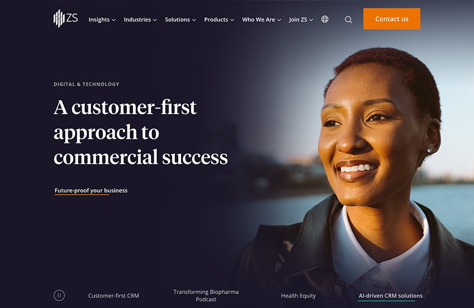
Accessibility Overhaul
From Zero to 100% AA Compliance
ZS’s design system wasn’t initially accessibility-focused, but client audits and our inclusion goals made it a priority—shifting both our system and culture toward more thoughtful, inclusive design.

My Role
Led accessibility efforts in partnership with UX leadership, embedding inclusive practices into the foundation of the design system.
Key Actions
- Audited the full design system for accessibility gaps
- Achieved WCAG Level AA compliance across all components (web + iOS)
- Defined keyboard/focus states, screen reader support, and color contrast standards
- Built accessible token libraries and documentation
- Integrated accessibility checks into design/dev workflows
- Collaborated with iOS engineers to apply the same standards to native components
Results
- 100% Level AA compliance across platforms while seeing where we could support AAA
- System supports screen readers, keyboard nav, and assistive tech
- Shifted accessibility from a checklist to a proactive mindset
- Ongoing monitoring in place with AAA goals ahead
- ZS now responds confidently to client audits with metics to back it up
Solving the Tough Stuff
Handling Ambiguity
There wasn’t a clear plan when we started the accessibility work, so I stepped in and figured it out. I came up with a rough timeline and some esitmates and from there, I audited the system across web and iOS, then turned WCAG guidelines into practical updates like keyboard states, screen reader support, and color contrast rules. I did the research and made calls that balanced usability, accessibility, and brand.
Pivitoing when Necessary
Some updates that worked for web didn’t carry over to iOS. Instead of forcing it, I partnered with the iOS team to adjust our approach and make sure both platforms could meet the same standards using tools that fit their setup.
Leadership and Ownership
I led the accessibility work from start to finish. That included the audit, token libraries, documentation, and working with design and engineering to build it into our workflow. I helped the team see why it mattered and made it something we all prioritize.
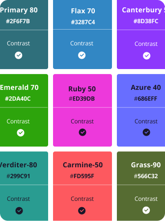
Color Accessibility
Focusing on color accessibility by choosing inclusive palettes and testing contrast to make sure designs are clear and usable for everyone.
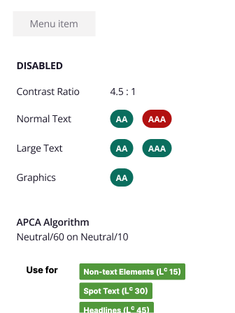
Component Audit
Each component was audited to ensure it met a minimum of AA accessibility standards, improving overall usability and compliance.
Tracking AAA
A tracking document was maintained to monitor progress and identify opportunities for eventually reaching AAA compliance.
Design Tokens
Building a Scalable, Cross-Platform Foundation
To create a scalable, consistent foundation, I introduced design tokens to align visual language and bridge design-dev gaps. The system brought clarity, consistency, and remains key to cross-platform collaboration.
My Role
Led the research, definition, and implementation of a cross-platform design token system.
Contributions
Research & Strategy
- Took the lead on digging into token best practices to make sure what we built could scale
- Set up a solid foundation that aligned with modern design system standards and could grow with us
Naming & Implementation
- Created a clean, easy-to-follow naming convention that made sense for everyone
- Rolled out the full color palette and tokens in Figma
- Kept a shared token reference sheet up to date so the whole team could stay on the same page and update whenever necessary
Component Integration
- Updated components to use tokens making things more consistent and future-friendly
- Continually spotted new opportunities to expand token usage as the system evolved
Cross-Platform Collaboration
- iOS Alignment
- Brought tokens over to iOS so they could be used with minimal tweaks
- Using the same naming system helped cut down on duplicate work and kept things aligned across platforms
- Team Enablement
- Worked with team designers to get the whole org up to speed on tokens
- We became the go-to folks on the design team for anything token-related
Solving the Tough Stuff
Handling Ambiguity
I led the research on how to set up tokens in a way that could scale. There were a lot of options, so I focused on creating a foundation that was flexible but still easy for the team to use and understand.
Pivitoing when Necessary
As we rolled out tokens, we hit some snags. That’s life! We ran into some edge cases, things that didn’t quite work. I adjusted as we went, cleaned up naming, reorganized the reference sheet, and tweaked component setups to keep things simple and scalable.
Leadership and Ownership
I owned the token work from start to finish. I handled naming, setup in Figma, rollout across components, and kept the reference doc up to date. I also worked with iOS to bring tokens over in a way that avoided duplicate work and kept us aligned.
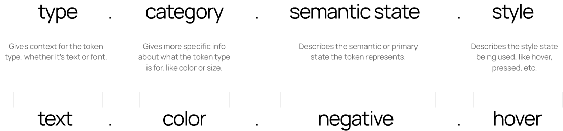
Making Figma Tokens Simple
Creating global tokens that align with engineering and are easy for designers to find, understand, and use.
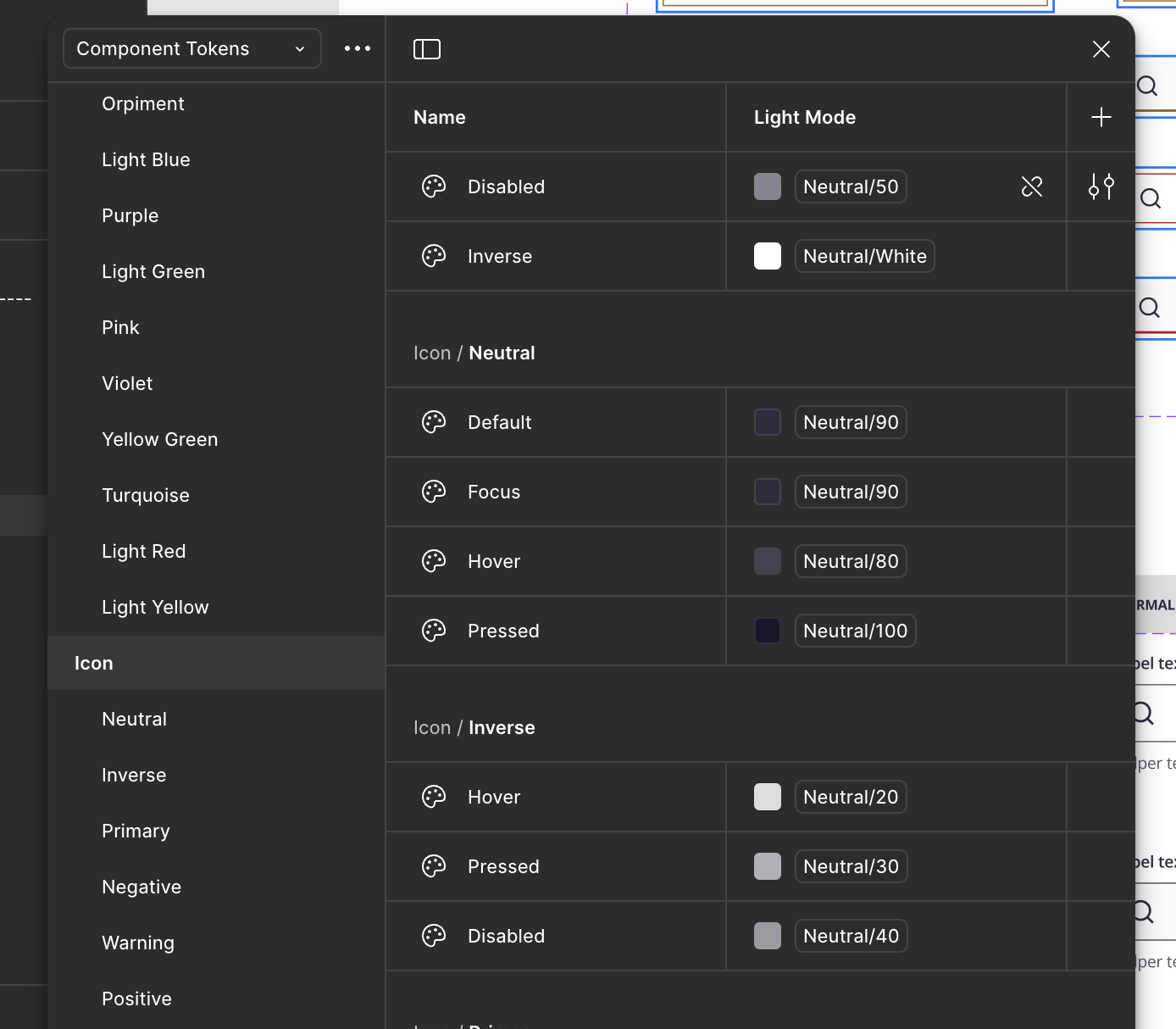
ZDS Token Structure
iOS - Mapping
iOS - Menu
iOS - Tabs
ZS Associates
UI Design
At ZS, I modernized components, applied design tokens, and streamlined documentation to improve clarity and usability for designers and developers.
UX Design
I design for real people, combining research, strategy, and intuition to create thoughtful, problem-solving experiences.
Leadership
I lead through clear communication, cross-team collaboration, and creating space for ideas to grow and projects to move forward.
Strategy
I turn research and data into smart design strategies that align business goals with user needs, connecting insight and creativity to guide projects forward.
Accessibility Overhaul
From Zero to 100% AA Compliance
ZS’s design system wasn’t initially accessibility-focused, but client audits and our inclusion goals made it a priority—shifting both our system and culture toward more thoughtful, inclusive design.
My Role
Led accessibility efforts in partnership with UX leadership, embedding inclusive practices into the foundation of the design system.
Key Actions
- Audited the full design system for accessibility gaps
- Achieved WCAG Level AA compliance across all components (web + iOS)
- Defined keyboard/focus states, screen reader support, and color contrast standards
- Built accessible token libraries and documentation
- Integrated accessibility checks into design/dev workflows
- Collaborated with iOS engineers to apply the same standards to native components
Results
- 100% Level AA compliance across platforms while seeing where we could support AAA
- System supports screen readers, keyboard nav, and assistive tech
- Shifted accessibility from a checklist to a proactive mindset
- Ongoing monitoring in place with AAA goals ahead
- ZS now responds confidently to client audits with metics to back it up
Solving the Tough Stuff
Handling Ambiguity
There wasn’t a clear plan when we started the accessibility work, so I stepped in and figured it out. I came up with a rough timeline and some esitmates and from there, I audited the system across web and iOS, then turned WCAG guidelines into practical updates like keyboard states, screen reader support, and color contrast rules. I did the research and made calls that balanced usability, accessibility, and brand.
Pivitoing when Necessary
Some updates that worked for web didn’t carry over to iOS. Instead of forcing it, I partnered with the iOS team to adjust our approach and make sure both platforms could meet the same standards using tools that fit their setup.
Leadership and Ownership
I led the accessibility work from start to finish. That included the audit, token libraries, documentation, and working with design and engineering to build it into our workflow. I helped the team see why it mattered and made it something we all prioritize.
Color Accessibility
Focusing on color accessibility by choosing inclusive palettes and testing contrast to make sure designs are clear and usable for everyone.
Component Audit
Each component was audited to ensure it met a minimum of AA accessibility standards, improving overall usability and compliance.
Tracking AAA
A tracking document was maintained to monitor progress and identify opportunities for eventually reaching AAA compliance.
ZDS Component Examples
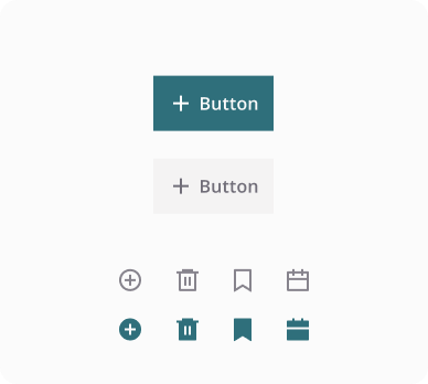
Buttons & Icons
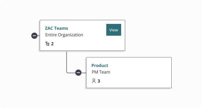
Node Connectors
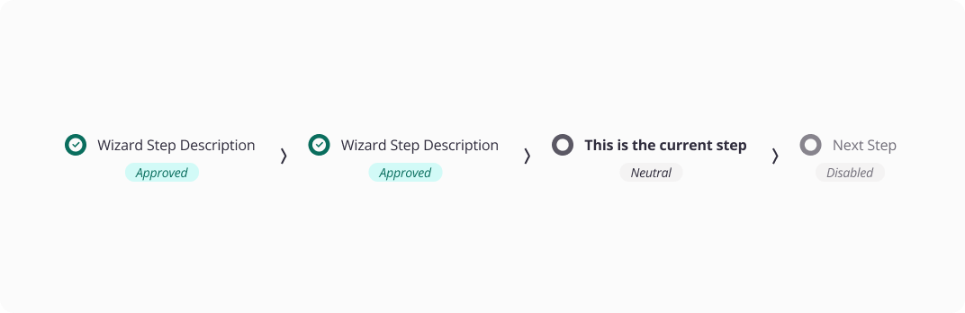
Wizard
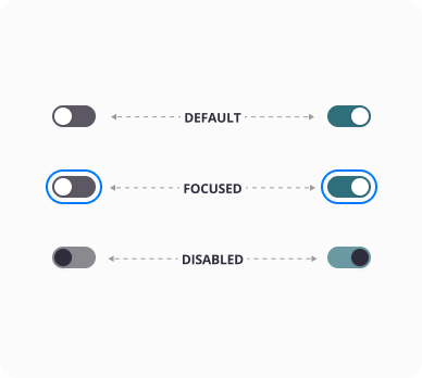
Toggles
Illustrations
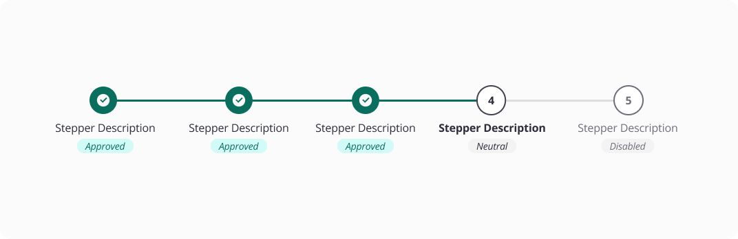
Stepper
Design Tokens
Building a Scalable, Cross-Platform Foundation
To create a scalable, consistent foundation, I introduced design tokens to align visual language and bridge design-dev gaps. The system brought clarity, consistency, and remains key to cross-platform collaboration.
My Role
Led the research, definition, and implementation of a cross-platform design token system.
Contributions
Research & Strategy
- Took the lead on digging into token best practices to make sure what we built could scale
- Set up a solid foundation that aligned with modern design system standards and could grow with us
Naming & Implementation
- Created a clean, easy-to-follow naming convention that made sense for everyone
- Rolled out the full color palette and tokens in Figma
- Kept a shared token reference sheet up to date so the whole team could stay on the same page and update whenever necessary
Component Integration
- Updated components to use tokens making things more consistent and future-friendly
- Continually spotted new opportunities to expand token usage as the system evolved
Cross-Platform Collaboration
- iOS Alignment
- Brought tokens over to iOS so they could be used with minimal tweaks
- Using the same naming system helped cut down on duplicate work and kept things aligned across platforms
- Team Enablement
- Worked with team designers to get the whole org up to speed on tokens
- We became the go-to folks on the design team for anything token-related
Solving the Tough Stuff
Handling Ambiguity
I led the research on how to set up tokens in a way that could scale. There were a lot of options, so I focused on creating a foundation that was flexible but still easy for the team to use and understand.
Pivitoing when Necessary
As we rolled out tokens, we hit some snags. That’s life! We ran into some edge cases, things that didn’t quite work. I adjusted as we went, cleaned up naming, reorganized the reference sheet, and tweaked component setups to keep things simple and scalable.
Leadership and Ownership
I owned the token work from start to finish. I handled naming, setup in Figma, rollout across components, and kept the reference doc up to date. I also worked with iOS to bring tokens over in a way that avoided duplicate work and kept us aligned.
Making Figma Tokens Simple
Creating global tokens that align with engineering and are easy for designers to find, understand, and use.
ZDS Token Structure
ZDS iOS Components
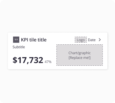
KPI Card
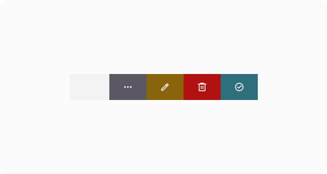
Swipe Action
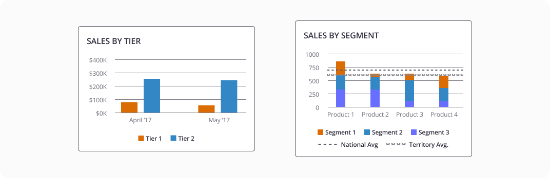
Data Viz
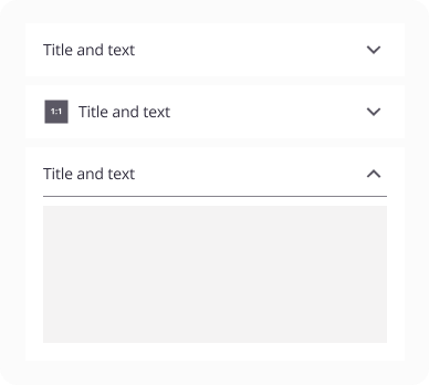
Accordian
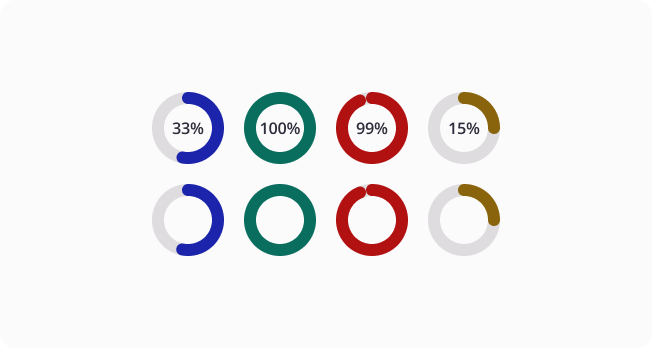
Progress Bar - Circular
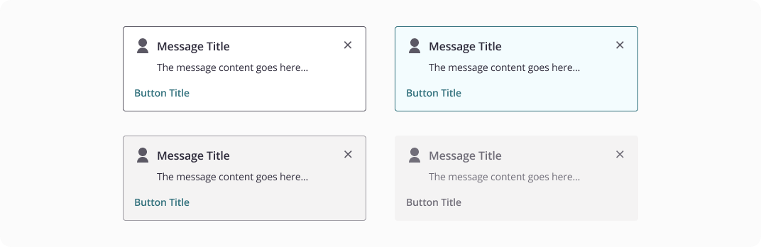
Message
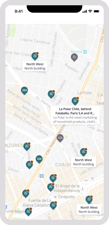
iOS - Mapping
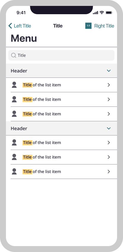
iOS - Menu
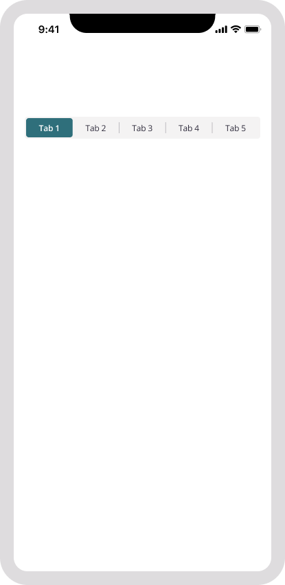
iOS - Tabs
ZS Associates
UI Design
At ZS, I modernized components, applied design tokens, and streamlined documentation to improve clarity and usability for designers and developers.
UX Design
I design for real people, combining research, strategy, and intuition to create thoughtful, problem-solving experiences.
Leadership
I lead through clear communication, cross-team collaboration, and creating space for ideas to grow and projects to move forward.
Strategy
I turn research and data into smart design strategies that align business goals with user needs, connecting insight and creativity to guide projects forward.
Accessibility Overhaul
From Zero to 100% AA Compliance
ZS’s design system wasn’t initially accessibility-focused, but client audits and our inclusion goals made it a priority—shifting both our system and culture toward more thoughtful, inclusive design.
My Role
Led accessibility efforts in partnership with UX leadership, embedding inclusive practices into the foundation of the design system.
Key Actions
- Audited the full design system for accessibility gaps
- Achieved WCAG Level AA compliance across all components (web + iOS)
- Defined keyboard/focus states, screen reader support, and color contrast standards
- Built accessible token libraries and documentation
- Integrated accessibility checks into design/dev workflows
- Collaborated with iOS engineers to apply the same standards to native components
Results
- 100% Level AA compliance across platforms while seeing where we could support AAA
- System supports screen readers, keyboard nav, and assistive tech
- Shifted accessibility from a checklist to a proactive mindset
- Ongoing monitoring in place with AAA goals ahead
- ZS now responds confidently to client audits with metics to back it up
Solving the Tough Stuff
Handling Ambiguity
There wasn’t a clear plan when we started the accessibility work, so I stepped in and figured it out. I came up with a rough timeline and some estimates and from there, I audited the system across web and iOS. I turned to WCAG guidelines to input practical updates like keyboard states, screen reader support, and color contrast rules. I made calls that balanced usability and accessibility.
Pivoting when Necessary
Some updates that worked for web didn’t carry over to iOS. Instead of forcing it, I partnered with the iOS team to adjust our approach and make sure both platforms could meet the same standards using tools that fit their setup.
Leadership and Ownership
I led the accessibility work from start to finish. That included the audit, token libraries, documentation, and working with design and engineering to build it into our workflow. I helped the team see why it mattered and made it something we all prioritize.
Color Accessibility
Focusing on color accessibility by choosing inclusive palettes and testing contrast to make sure designs are clear and usable for everyone.
Component Audit
Each component was audited to ensure it met a minimum of AA accessibility standards, improving overall usability and compliance.
Tracking AAA
A tracking document was maintained to monitor progress and identify opportunities for eventually reaching AAA compliance.
ZDS Component Examples
Buttons & Icons
Node Connectors
Wizard
Toggles
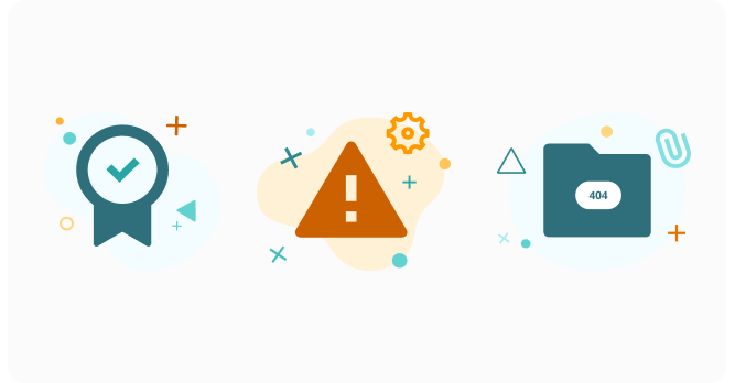
Illustrations
Stepper
Design Tokens
Building a Scalable, Cross-Platform Foundation
To create a scalable, consistent foundation, I introduced design tokens to align visual language and bridge design-dev gaps. The system brought clarity, consistency, and remains key to cross-platform collaboration.
My Role
Led the research, definition, and implementation of a cross-platform design token system.
Contributions
Research & Strategy
- Took the lead on digging into token best practices to make sure what we built could scale
- Set up a solid foundation that aligned with modern design system standards and could grow with us
Naming & Implementation
- Created a clean, easy-to-follow naming convention that made sense for everyone
- Rolled out the full color palette and tokens in Figma
- Kept a shared token reference sheet up to date so the whole team could stay on the same page and update whenever necessary
Component Integration
- Updated components to use tokens making things more consistent and future-friendly
- Continually spotted new opportunities to expand token usage as the system evolved
Cross-Platform Collaboration
- iOS Alignment
- Brought tokens over to iOS so they could be used with minimal tweaks
- Using the same naming system helped cut down on duplicate work and kept things aligned across platforms
- Team Enablement
- Worked with team designers to get the whole org up to speed on tokens
- We became the go-to folks on the design team for anything token-related
Solving the Tough Stuff
Handling Ambiguity
I led the research on how to set up tokens in a way that could scale. There were a lot of options, so I focused on creating a foundation that was flexible but still easy for the team to use and understand.
Pivoting when Necessary
As we rolled out tokens, we hit some snags. That’s life! We ran into some edge cases, things that didn’t quite work. I adjusted as we went, cleaned up naming, reorganized the reference sheet, and tweaked component setups to keep things simple and scalable.
Leadership and Ownership
I owned the token work from start to finish. I handled naming, setup in Figma, rollout across components, and kept the reference doc up to date. I also worked with iOS to bring tokens over in a way that avoided duplicate work and kept us aligned.
Making Figma Tokens Simple
Creating global tokens that align with engineering and are easy for designers to find, understand, and use.
ZDS Token Structure
ZDS iOS Components
KPI Card
Swipe Action
Data Viz
Accordion
Progress Bar - Circular
Message
iOS - Mapping
iOS - Menu
iOS - Tabs