
ALL PROJECTS
CASE STUDY · 2026
Epsilon PeopleCloud — Enterprise Data Platform and Architecture Modernization
ROLE
Product Designer
TIMELINE
2021-2022
TEAM
Core Systems Team
(Product, Design, Engineering)
Multi-tenant enterprise users faced fragmented campaign workflows, complex ingestion rules, and unmanaged error states across legacy tools. I led the product design and interface architecture to unify PeopleCloud into a modular, token-driven platform—eliminating interface drift, standardizing data pipelines, and accelerating client onboarding at enterprise scale.
EPSILON PEOPLECLOUD
Turning high-density operational friction into scalable enterprise
workflow control.
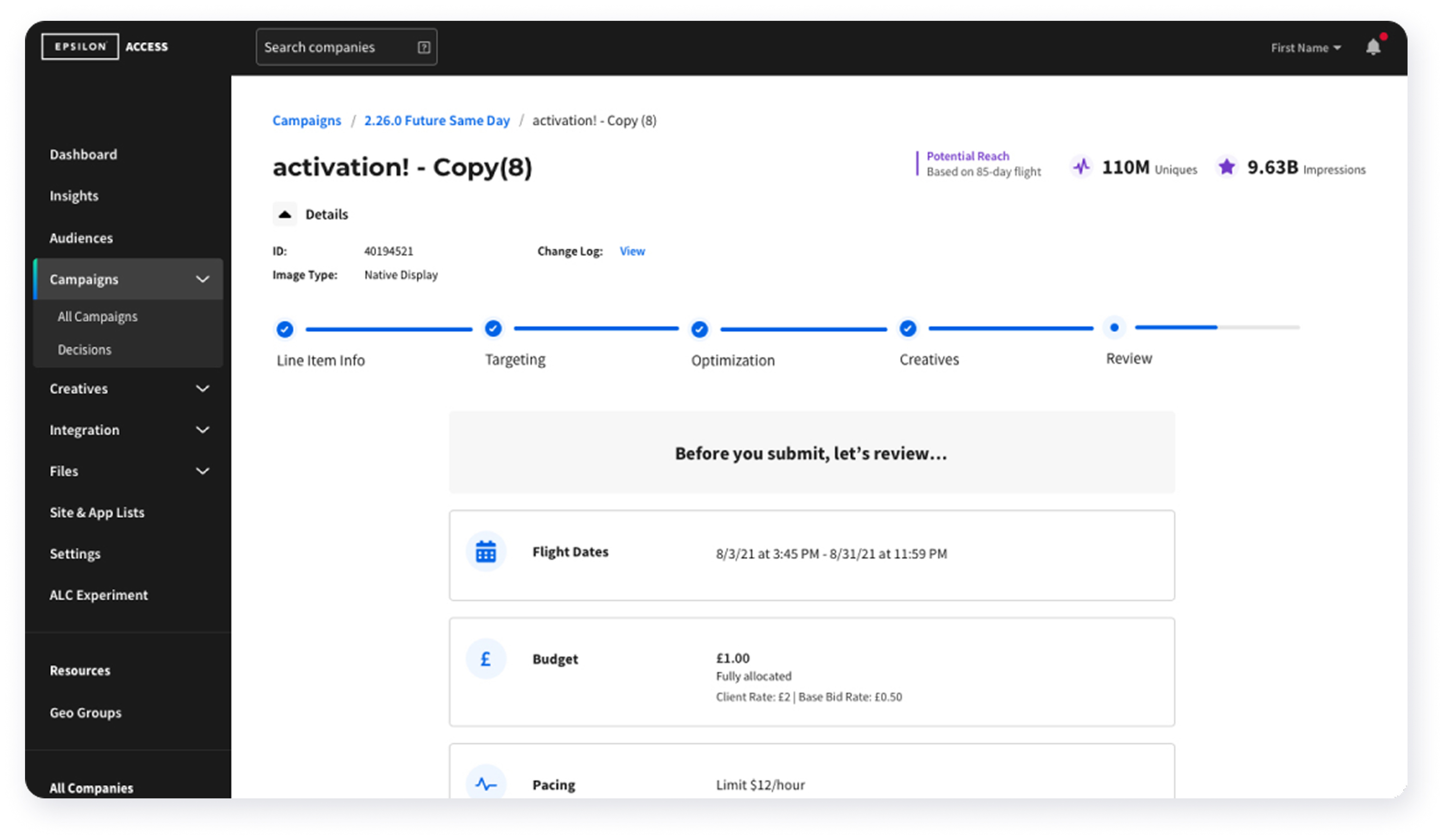
Media buyers managing enterprise accounts in Epsilon PeopleCloud frequently reallocate dynamic budgets across dozens of live programmatic line items. The legacy workflow relied on detached modals and manual offline calculations, increasing the risk of costly overspend errors. I designed a unified inline allocation engine that provides immediate financial validation while preserving operator velocity.
THE AD-OPS FRICTIONFragmented context and high-risk manual calculation
- Context Switching: Modal-based line item edits separated operators from aggregate pacing tables, obscuring real-time budget health.
- Capital Allocation Risk: Manual, offline pacing calculations increased the risk of costly overspend errors across live programmatic campaigns.
- Pattern Fragmentation: Disparate custom input fields across PeopleCloud modules degraded muscle memory and prolonged onboarding.
THE DESIGN INTERVENTION
Inline allocation engine with algorithmic guardrails
- Core Action Grouping: Consolidated ad-hoc workflows into four standardized operational states: Increase, Decrease, Reset, and Transfer.
- Zero-Latency Validation: Integrated real-time remaining-balance and pacing feedback before committing state changes.
- Keyboard Ergonomics: Engineered rapid tab-indexing and escape shortcuts to enable high-volume bulk edits without mouse dependency.
THE IMPACT
Standardized enterprise velocity and financial safety
- Design System Integration: Published the unified allocation pattern to core libraries, deprecating redundant legacy inputs across squads.
- Accessible by Default: Built with persistent keyboard focus indicators, tokenized contrast boundaries, and ARIA live region status announcements.
- Persistent Spatial Context: Replaced disruptive modal takeovers with an inline drawer, preserving complete data-table orientation during rapid budget reallocations.
SYSTEM GOVERNANCE & CORE WORKFLOWS
Turning high-density operational friction into scalable enterprise workflow control.
Across Epsilon PeopleCloud squads, broken table interactions, fragmented notification patterns, and absent audit trails led to high-risk manual workarounds. I unified these fragmented touchpoints into an accessible, high-performance design system engineered for velocity, regulatory compliance, and multi-user accountability.
Core Pattern
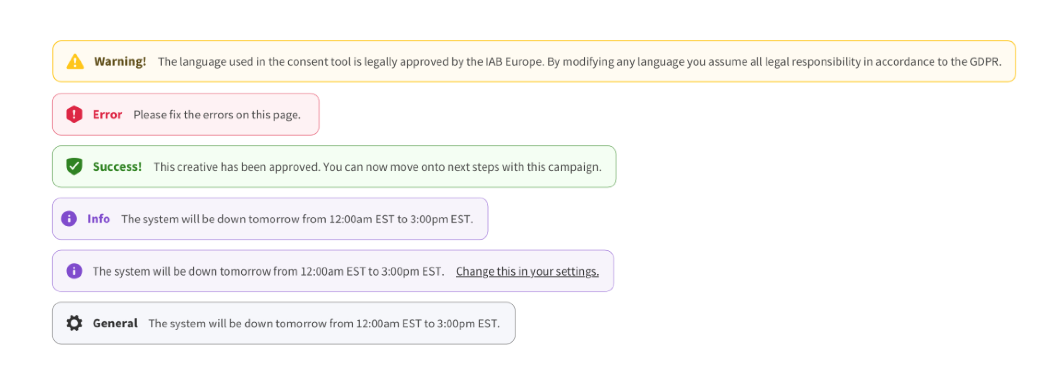
Accessible Notification & Alert Architecture
The Challenge
Inconsistent feedback patterns left operators disoriented across complex campaign setups, resulting in accidental misconfigurations and heightened GDPR compliance exposure.
- The System Solution
- Semantic Token Architecture: Built a unified, WCAG AA compliant alert hierarchy using strict semantic color tokens and icon pairings (Warning, Error, Success, Info).
- Contextual Recovery Paths: Replaced dead-end error messages with inline action links and clear dismissibility logic to let users resolve issues at the source.
- Plain-Language Standards: Eliminated cryptic developer error codes and legacy technical jargon in favor of scannable, actionable microcopy.
COMPLEX WORKFLOW
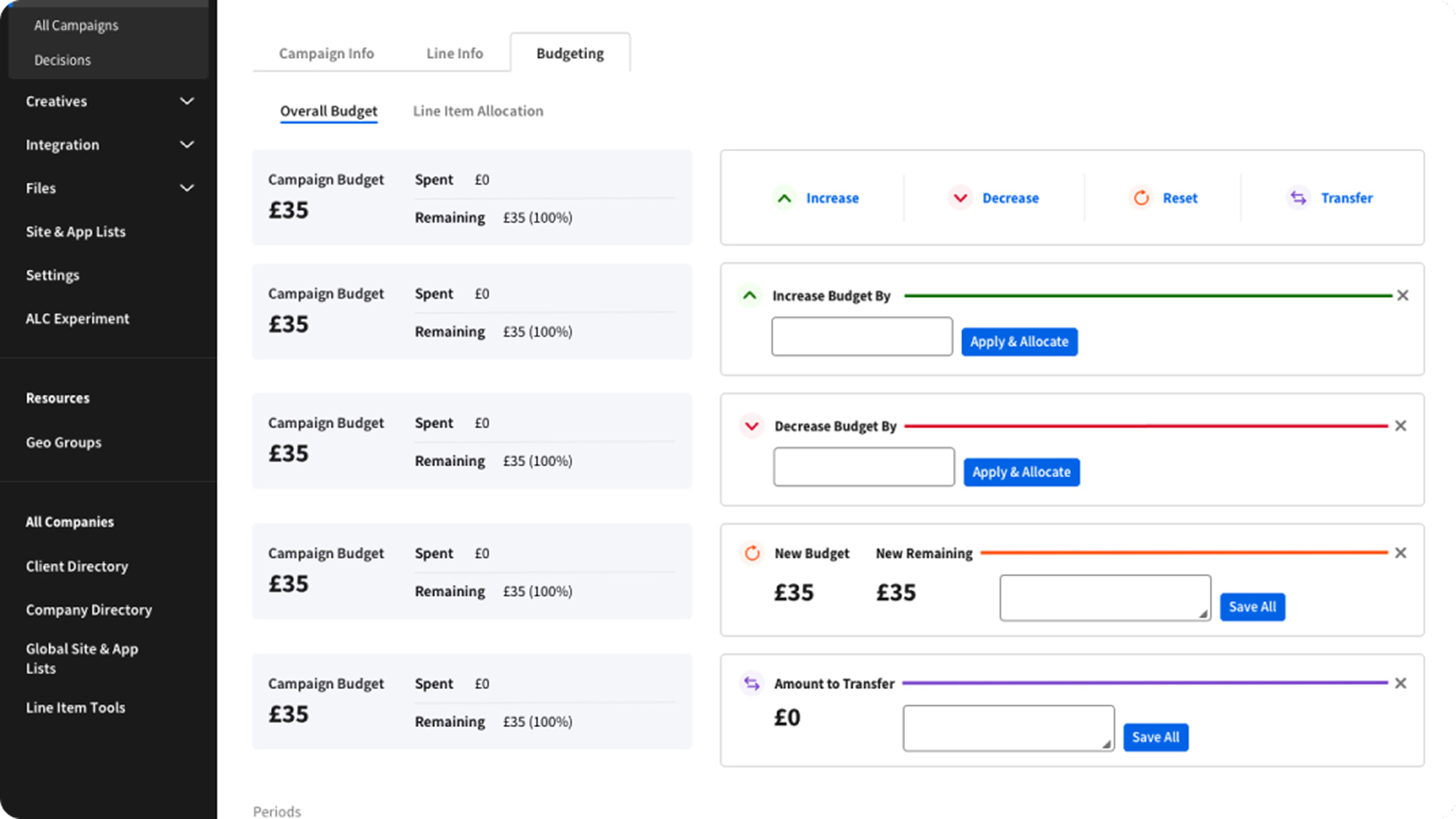
Dynamic Budget & Allocation Controls
The Challenge
Media planners lacked real-time visibility into shifting campaign balances, making frequent intra-day budget reallocations slow, cumbersome, and prone to costly overspend.
- The System Solution
- Predictive Allocation Previews: Engineered dynamic calculation states that display projected remaining balances and total campaign impact before operators commit changes.
- Modular Adjustment Patterns: Standardized 4 high-frequency financial actions (Increase, Decrease, Reset, Transfer) into consistent inline controls with real-time threshold validation.
- High-Density Table Ergonomics: Designed compact, high-contrast input cells and clear focus targets, enabling rapid data entry across dense enterprise tables without visual fatigue.
Auditability
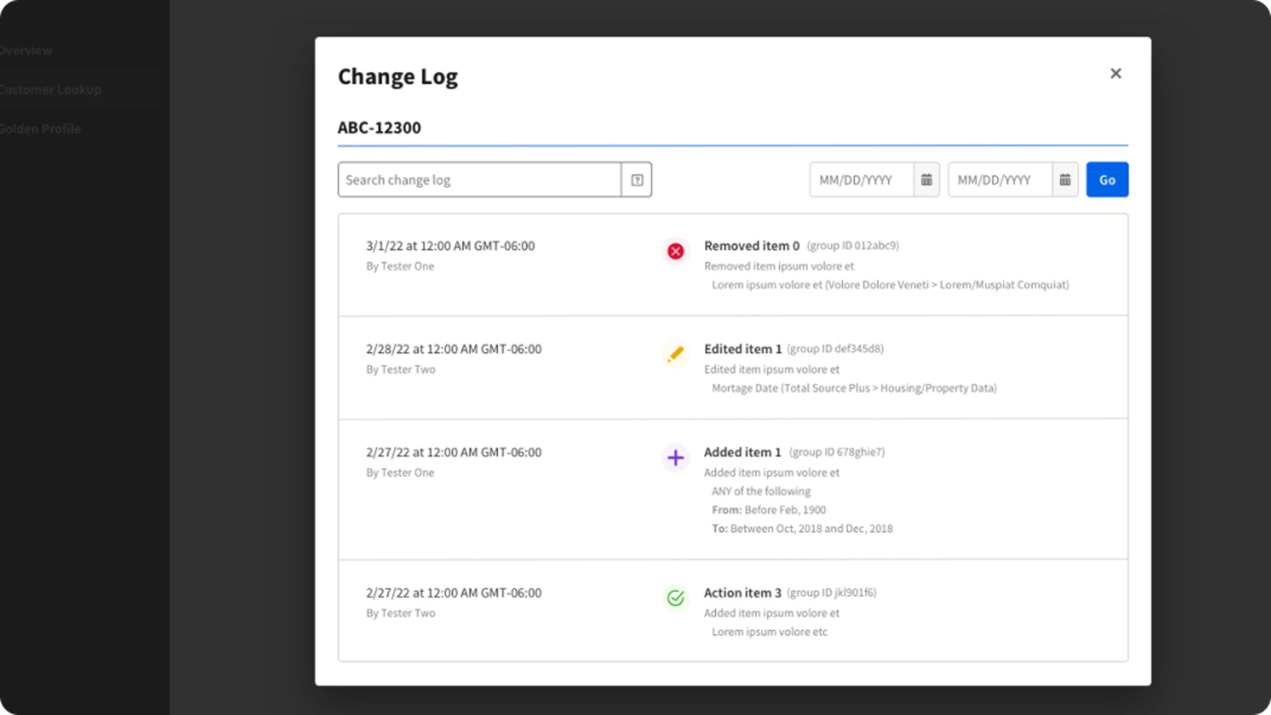
Enterprise Change Log & History Tracking
The Challenge
Multi-user enterprise teams lacked visibility into campaign configuration history, turning error triage, root-cause debugging, and compliance auditing into costly, slow forensics.
- The System Solution
- Semantic Action Taxonomies: Standardized immutable event statuses (Removed, Edited, Added, Action) paired with color tokens and distinct icons for rapid timeline scanning.
- Granular Query Ergonomics: Introduced combined date-range filtering, freeform text search, and unique record ID indexing to instantly isolate critical changes.
- Traceable Attribution: Structured clear accountability layers displaying exact timestamps, user attribution, and before-and-after metadata differentials within a focused modal pattern.
Enterprise speed requires structural predictability, not visual minimalism.
Designing for high-risk advertising operations meant prioritizing dense, unambiguous feedback over sparse layouts. Pairing real-time calculation previews with rigid semantic alert tokens gave multi-user teams the clarity to execute high-volume campaign adjustments without operational panic or costly missteps.
EDGE CASES & RESILIENCY
Designing for Enterprise Scale, Concurrency, and Error Recovery
Architecting defensive UX patterns to prevent data loss, resolve conflicts, and maintain state integrity across critical failures.
01
Validation & Error Recovery
Trigger: Form submission failure across multi-tab configuration flows.
Solution: Field-level inline alerts with smart auto-scroll, preserving input state across session boundaries without data loss.
02
Asynchronous Review Loops
Trigger: Stakeholder rejection during multi-tier approval cycles.
Solution: In-app notification banners paired with contextual deep-links that pin review comments directly to the affected parameters.
03
Session State Persistence
Trigger: Gateway timeout or unexpected tab close mid-workflow.
Solution: Background optimistic auto-saving that restores incomplete drafts to the exact sub-step upon re-authentication.
04
Concurrent Multi-User Conflicts
Trigger: Simultaneous edits by multiple regional media planners.
Solution: Real-time optimistic UI locking with banner alerts, shifting secondary collaborators into explicit read-only modes to prevent data overwrite.
BUSINESS & OPERATIONAL IMPACT
Key Takeaways & Impact
01 / SYSTEM VELOCITY
Accelerated Sprint Handoffs
Standardized component tokens and reusable layout primitives cut front-end build time and shortened design-to-code handoffs across core modules.
02 / COMPLIANCE & ACCESSIBILITY
Enterprise WCAG 2.1 AA Parity
Refactored color contrast, keyboard navigation, and focus states across the platform, eliminating accessibility compliance risk on high-traffic workflows.
04 / DESIGN SYSTEM GOVERNANCE
Scalable Onboarding & Adoption
Published comprehensive usage patterns and interactive component specs, streamlining designer onboarding and establishing cross-squad adoption.
03 / CROSS-FUNCTIONAL EFFICIENCY
Reduced UI Drift & Tech Debt
Established shared component specs and recurring engineering syncs, significantly cutting mid-sprint layout rework and ad-hoc CSS overrides.
REFLECTIONS & FUTURE STATE
Good architecture solves the components; great governance aligns the org.
What worked
Co-locating specs with engineering: Defining token structures alongside front-end leads early prevented downstream component drift.
Component-first stress testing: Validating components against dense data edge cases early ensured zero layout breakage at scale.
Continuous alignment rituals: Weekly design-to-code reviews created shared ownership between design and development squads.
What I'd do differently
Automate token synchronization: Implement automated design token pipelines (Figma to code tokens) earlier to eliminate manual spec updates.
Establish formal system telemetry: Track component adoption and detached-instance metrics via automated analytics from day one.
Define multi-brand architecture upfront: Plan for future multi-tenant theming earlier in the component inheritance hierarchy.
Looking forward
Multi-Tenant Theming: Extending token schemas to support white-label customer deployments seamlessly.
Automated Accessibility Testing: Integrating automated CI/CD accessibility linters directly into the component pipeline.
Design Token Pipelines: Connecting design libraries directly into production repositories for continuous deployment.


Sheila Sczepanik
Senior Product Designer
Specializing in enterprise tools, multi-brand design systems, and complex data-dense workflows that scale effortlessly for engineering teams.


ALL PROJECTS
CASE STUDY · 2026
Epsilon PeopleCloud — Enterprise Data Platform and Architecture Modernization
ROLE
Product Designer
TIMELINE
2021-2022
TEAM
Core Systems Team
(Product, Design, Engineering)
Multi-tenant enterprise users faced fragmented campaign workflows, complex ingestion rules, and unmanaged error states across legacy tools. I led the product design and interface architecture to unify PeopleCloud into a modular, token-driven platform—eliminating interface drift, standardizing data pipelines, and accelerating client onboarding at enterprise scale.
EPSILON PEOPLECLOUD
Turning high-density operational friction into scalable enterprise workflow control.
Media buyers managing enterprise accounts in Epsilon PeopleCloud frequently reallocate dynamic budgets across dozens of live programmatic line items. The legacy workflow relied on detached modals and manual offline calculations, increasing the risk of costly overspend errors. I designed a unified inline allocation engine that provides immediate financial validation while preserving operator velocity.
THE AD-OPS FRICTIONFragmented context and high-risk manual calculation
- Context Switching: Modal-based line item edits separated operators from aggregate pacing tables, obscuring real-time budget health.
- Capital Allocation Risk: Manual, offline pacing calculations increased the risk of costly overspend errors across live programmatic campaigns.
- Pattern Fragmentation: Disparate custom input fields across PeopleCloud modules degraded muscle memory and prolonged onboarding.
THE DESIGN INTERVENTION
Inline allocation engine with algorithmic guardrails
- Core Action Grouping: Consolidated ad-hoc workflows into four standardized operational states: Increase, Decrease, Reset, and Transfer.
- Zero-Latency Validation: Integrated real-time remaining-balance and pacing feedback before committing state changes.
- Keyboard Ergonomics: Engineered rapid tab-indexing and escape shortcuts to enable high-volume bulk edits without mouse dependency.
THE IMPACT
Standardized enterprise velocity and financial safety
- Design System Integration: Published the unified allocation pattern to core libraries, deprecating redundant legacy inputs across squads.
- Accessible by Default: Built with persistent keyboard focus indicators, tokenized contrast boundaries, and ARIA live region status announcements.
- Persistent Spatial Context: Replaced disruptive modal takeovers with an inline drawer, preserving complete data-table orientation during rapid budget reallocations.
SYSTEM GOVERNANCE & CORE WORKFLOWS
Turning high-density operational friction into scalable enterprise workflow control.
Across Epsilon PeopleCloud squads, broken table interactions, fragmented notification patterns, and absent audit trails led to high-risk manual workarounds. I unified these fragmented touchpoints into an accessible, high-performance design system engineered for velocity, regulatory compliance, and multi-user accountability.
Core Pattern
Accessible Notification & Alert Architecture
The Challenge
Inconsistent feedback patterns left operators disoriented across complex campaign setups, resulting in accidental misconfigurations and heightened GDPR compliance exposure.
- The System Solution
- Semantic Token Architecture: Built a unified, WCAG AA compliant alert hierarchy using strict semantic color tokens and icon pairings (Warning, Error, Success, Info).
- Contextual Recovery Paths: Replaced dead-end error messages with inline action links and clear dismissibility logic to let users resolve issues at the source.
- Plain-Language Standards: Eliminated cryptic developer error codes and legacy technical jargon in favor of scannable, actionable microcopy.
COMPLEX WORKFLOW
Dynamic Budget & Allocation Controls
The Challenge
Media planners lacked real-time visibility into shifting campaign balances, making frequent intra-day budget reallocations slow, cumbersome, and prone to costly overspend.
- The System Solution
- Predictive Allocation Previews: Engineered dynamic calculation states that display projected remaining balances and total campaign impact before operators commit changes.
- Modular Adjustment Patterns: Standardized 4 high-frequency financial actions (Increase, Decrease, Reset, Transfer) into consistent inline controls with real-time threshold validation.
- High-Density Table Ergonomics: Designed compact, high-contrast input cells and clear focus targets, enabling rapid data entry across dense enterprise tables without visual fatigue.
Auditability
Enterprise Change Log & History Tracking
The Challenge
Multi-user enterprise teams lacked visibility into campaign configuration history, turning error triage, root-cause debugging, and compliance auditing into costly, slow forensics.
- The System Solution
- Semantic Action Taxonomies: Standardized immutable event statuses (Removed, Edited, Added, Action) paired with color tokens and distinct icons for rapid timeline scanning.
- Granular Query Ergonomics: Introduced combined date-range filtering, freeform text search, and unique record ID indexing to instantly isolate critical changes.
- Traceable Attribution: Structured clear accountability layers displaying exact timestamps, user attribution, and before-and-after metadata differentials within a focused modal pattern.
Enterprise speed requires structural predictability, not visual minimalism.
Designing for high-risk advertising operations meant prioritizing dense, unambiguous feedback over sparse layouts. Pairing real-time calculation previews with rigid semantic alert tokens gave multi-user teams the clarity to execute high-volume campaign adjustments without operational panic or costly missteps.
EDGE CASES & RESILIENCY
Designing for Enterprise Scale, Concurrency, and Error Recovery
Architecting defensive UX patterns to prevent data loss, resolve conflicts, and maintain state integrity across critical failures.
01
Validation & Error Recovery
Trigger: Form submission failure across multi-tab configuration flows.
Solution: Field-level inline alerts with smart auto-scroll, preserving input state across session boundaries without data loss.
02
Asynchronous Review Loops
Trigger: Stakeholder rejection during multi-tier approval cycles.
Solution: In-app notification banners paired with contextual deep-links that pin review comments directly to the affected parameters.
03
Session State Persistence
Trigger: Gateway timeout or unexpected tab close mid-workflow.
Solution: Background optimistic auto-saving that restores incomplete drafts to the exact sub-step upon re-authentication.
04
Concurrent Multi-User Conflicts
Trigger: Simultaneous edits by multiple regional media planners.
Solution: Real-time optimistic UI locking with banner alerts, shifting secondary collaborators into explicit read-only modes to prevent data overwrite.
BUSINESS & OPERATIONAL IMPACT
Key Takeaways & Impact
01 / SYSTEM VELOCITY
Accelerated Sprint Handoffs
Standardized component tokens and reusable layout primitives cut front-end build time and shortened design-to-code handoffs across core modules.
02 / COMPLIANCE & ACCESSIBILITY
Enterprise WCAG 2.1 AA Parity
Refactored color contrast, keyboard navigation, and focus states across the platform, eliminating accessibility compliance risk on high-traffic workflows.
04 / DESIGN SYSTEM GOVERNANCE
Scalable Onboarding & Adoption
Published comprehensive usage patterns and interactive component specs, streamlining designer onboarding and establishing cross-squad adoption.
03 / CROSS-FUNCTIONAL EFFICIENCY
Reduced UI Drift & Tech Debt
Established shared component specs and recurring engineering syncs, significantly cutting mid-sprint layout rework and ad-hoc CSS overrides.
REFLECTIONS & FUTURE STATE
Good architecture solves the components; great governance aligns the org.
What worked
Co-locating specs with engineering: Defining token structures alongside front-end leads early prevented downstream component drift.
Component-first stress testing: Validating components against dense data edge cases early ensured zero layout breakage at scale.
Continuous alignment rituals: Weekly design-to-code reviews created shared ownership between design and development squads.
What I'd do differently
Automate token synchronization: Implement automated design token pipelines (Figma to code tokens) earlier to eliminate manual spec updates.
Establish formal system telemetry: Track component adoption and detached-instance metrics via automated analytics from day one.
Define multi-brand architecture upfront: Plan for future multi-tenant theming earlier in the component inheritance hierarchy.
Looking forward
Multi-Tenant Theming: Extending token schemas to support white-label customer deployments seamlessly.
Automated Accessibility Testing: Integrating automated CI/CD accessibility linters directly into the component pipeline.
Design Token Pipelines: Connecting design libraries directly into production repositories for continuous deployment.
Sheila Sczepanik
Senior Product Designer
Specializing in enterprise tools, multi-brand design systems, and complex data-dense workflows that scale effortlessly for engineering teams.
ALL PROJECTS
CASE STUDY · ENTERPRISE SAAS & DATA SYSTEMS
Epsilon PeopleCloud — Enterprise Data Platform and Architecture Modernization
ROLE
Product Designer
TIMELINE
2021-2022
TEAM
Core Systems Team
(Product, Design, Engineering)
Multi-tenant enterprise users faced fragmented campaign workflows, complex ingestion rules, and unmanaged error states across legacy tools. I led the product design and interface architecture to unify PeopleCloud into a modular, token-driven platform—eliminating interface drift, standardizing data pipelines, and accelerating client onboarding at enterprise scale.
EPSILON PEOPLECLOUD
Turning high-density operational friction into scalable enterprise workflow control.
Media buyers managing enterprise accounts in Epsilon PeopleCloud frequently reallocate dynamic budgets across dozens of live programmatic line items. The legacy workflow relied on detached modals and manual offline calculations, increasing the risk of costly overspend errors. I designed a unified inline allocation engine that provides immediate financial validation while preserving operator velocity.
THE AD-OPS FRICTIONFragmented context and high-risk manual calculation
- Context Switching: Modal-based line item edits separated operators from aggregate pacing tables, obscuring real-time budget health.
- Capital Allocation Risk: Manual, offline pacing calculations increased the risk of costly overspend errors across live programmatic campaigns.
- Pattern Fragmentation: Disparate custom input fields across PeopleCloud modules degraded muscle memory and prolonged onboarding.
THE DESIGN INTERVENTION
Inline allocation engine with algorithmic guardrails
- Core Action Grouping: Consolidated ad-hoc workflows into four standardized operational states: Increase, Decrease, Reset, and Transfer.
- Zero-Latency Validation: Integrated real-time remaining-balance and pacing feedback before committing state changes.
- Keyboard Ergonomics: Engineered rapid tab-indexing and escape shortcuts to enable high-volume bulk edits without mouse dependency.
THE IMPACT
Standardized enterprise velocity and financial safety
- Design System Integration: Published the unified allocation pattern to core libraries, deprecating redundant legacy inputs across squads.
- Accessible by Default: Built with persistent keyboard focus indicators, tokenized contrast boundaries, and ARIA live region status announcements.
- Persistent Spatial Context: Replaced disruptive modal takeovers with an inline drawer, preserving complete data-table orientation during rapid budget reallocations.
SYSTEM GOVERNANCE & CORE WORKFLOWS
Turning high-density operational friction into scalable enterprise workflow control.
Across Epsilon PeopleCloud squads, broken table interactions, fragmented notification patterns, and absent audit trails led to high-risk manual workarounds. I unified these fragmented touchpoints into an accessible, high-performance design system engineered for velocity, regulatory compliance, and multi-user accountability.
Core Pattern
Accessible Notification & Alert Architecture
The Challenge
Inconsistent feedback patterns left operators disoriented across complex campaign setups, resulting in accidental misconfigurations and heightened GDPR compliance exposure.
The System Solution
- Semantic Token Architecture: Built a unified, WCAG AA compliant alert hierarchy using strict semantic color tokens and icon pairings (Warning, Error, Success, Info).
- Contextual Recovery Paths: Replaced dead-end error messages with inline action links and clear dismissibility logic to let users resolve issues at the source.
- Plain-Language Standards: Eliminated cryptic developer error codes and legacy technical jargon in favor of scannable, actionable microcopy.
COMPLEX WORKFLOW
Dynamic Budget & Allocation Controls
The Challenge
Media planners lacked real-time visibility into shifting campaign balances, making frequent intra-day budget reallocations slow, cumbersome, and prone to costly overspend.
The System Solution
- Predictive Allocation Previews: Engineered dynamic calculation states that display projected remaining balances and total campaign impact before operators commit changes.
- Modular Adjustment Patterns: Standardized 4 high-frequency financial actions (Increase, Decrease, Reset, Transfer) into consistent inline controls with real-time threshold validation.
- High-Density Table Ergonomics: Designed compact, high-contrast input cells and clear focus targets, enabling rapid data entry across dense enterprise tables without visual fatigue.
Auditability
Enterprise Change Log & History Tracking
The Challenge
Multi-user enterprise teams lacked visibility into campaign configuration history, turning error triage, root-cause debugging, and compliance auditing into costly, slow forensics.
The System Solution
- Semantic Action Taxonomies: Standardized immutable event statuses (Removed, Edited, Added, Action) paired with color tokens and distinct icons for rapid timeline scanning.
- Granular Query Ergonomics: Introduced combined date-range filtering, freeform text search, and unique record ID indexing to instantly isolate critical changes.
- Traceable Attribution: Structured clear accountability layers displaying exact timestamps, user attribution, and before-and-after metadata differentials within a focused modal pattern.
Enterprise speed requires structural predictability, not visual minimalism.
Designing for high-risk advertising operations meant prioritizing dense, unambiguous feedback over sparse layouts. Pairing real-time calculation previews with rigid semantic alert tokens gave multi-user teams the clarity to execute high-volume campaign adjustments without operational panic or costly missteps.
EDGE CASES & RESILIENCY
Designing for Enterprise Scale, Concurrency, and Error Recovery
Architecting defensive UX patterns to prevent data loss, resolve conflicts, and maintain state integrity across critical failures.
01
Validation & Error Recovery
Trigger: Form submission failure across multi-tab configuration flows.
Solution: Field-level inline alerts with smart auto-scroll, preserving input state across session boundaries without data loss.
02
Asynchronous Review Loops
Trigger: Stakeholder rejection during multi-tier approval cycles.
Solution: In-app notification banners paired with contextual deep-links that pin review comments directly to the affected parameters.
03
Session State Persistence
Trigger: Gateway timeout or unexpected tab close mid-workflow.
Solution: Background optimistic auto-saving that restores incomplete drafts to the exact sub-step upon re-authentication.
04
Concurrent Multi-User Conflicts
Trigger: Simultaneous edits by multiple regional media planners.
Solution: Real-time optimistic UI locking with banner alerts, shifting secondary collaborators into explicit read-only modes to prevent data overwrite.
BUSINESS & OPERATIONAL IMPACT
Key Takeaways & Impact
01 / SYSTEM VELOCITY
Accelerated Sprint Handoffs
Standardized component tokens and reusable layout primitives cut front-end build time and shortened design-to-code handoffs across core modules.
02 / COMPLIANCE & ACCESSIBILITY
Enterprise WCAG 2.1 AA Parity
Refactored color contrast, keyboard navigation, and focus states across the platform, eliminating accessibility compliance risk on high-traffic workflows.
04 / DESIGN SYSTEM GOVERNANCE
Scalable Onboarding & Adoption
Published comprehensive usage patterns and interactive component specs, streamlining designer onboarding and establishing cross-squad adoption.
03 / CROSS-FUNCTIONAL EFFICIENCY
Reduced UI Drift & Tech Debt
Established shared component specs and recurring engineering syncs, significantly cutting mid-sprint layout rework and ad-hoc CSS overrides.
REFLECTIONS & FUTURE STATE
Good architecture solves the components; great governance aligns the org.
What worked
Co-locating specs with engineering: Defining token structures alongside front-end leads early prevented downstream component drift.
Component-first stress testing: Validating components against dense data edge cases early ensured zero layout breakage at scale.
Continuous alignment rituals: Weekly design-to-code reviews created shared ownership between design and development squads.
What I'd do differently
Automate token synchronization: Implement automated design token pipelines (Figma to code tokens) earlier to eliminate manual spec updates.
Establish formal system telemetry: Track component adoption and detached-instance metrics via automated analytics from day one.
Define multi-brand architecture upfront: Plan for future multi-tenant theming earlier in the component inheritance hierarchy.
Looking forward
Multi-Tenant Theming: Extending token schemas to support white-label customer deployments seamlessly.
Automated Accessibility Testing: Integrating automated CI/CD accessibility linters directly into the component pipeline.
Design Token Pipelines: Connecting design libraries directly into production repositories for continuous deployment.