
ALL PROJECTS
CASE STUDY · 2026
Solar Flare — Music Analytics Dashboard and Real-Time Performance Hub
ROLE
Product Design, IA & Design Systems
PLATFORM
Web Dashboard
PROJECT TYPE
Concept Analytics Platform
Raw streaming and performance metrics often stay trapped in fragmented platforms, leaving artists and management teams sorting through disconnected figures instead of acting on them. Without a unified dashboard, identifying breakout playlist momentum and evaluating audience behavior becomes slow, manual work.
Solar Flare transforms complex multi-platform data into actionable, role-based insights. Designed with high-contrast data visualization, customizable chart modules, and granular user permissions, the platform empowers teams to monitor reach, revenue, and retention in real time.
At a glance: Goals
8M+
TARGET STREAM VOLUME
> 20%
SAVE RATE IMPROVEMENT
< 3s
QUERY PERFORMANCE THRESHOLD
CORE HYPOTHESES & DESIGN RATIONALE
Proposed discovery framework and core research hypotheses.
Streaming platforms provide high-level numbers, but fail to deliver the granular, cross-platform signals artists need to decide where to tour, which single to promote, or when to release a follow-up.
Imagine an independent album release, Solar Flare, building momentum across platforms but lacking unified tooling to interpret performance. The raw data exists, but actionable insight remains buried.
5 Artist & Manager Interviews
Questions I Would Ask:
- "Is looking at your streaming numbers actually useful, or does it just stress you out?"
- "What specific data do you actually share with your label or management team each week?"
- "When planning tour stops or single releases, how much is based on data vs. intuition?"
Competitive Landscape Audit
Gaps to Evaluate:
Unified Views: Do any current tools combine streams, saves, and playlist additions into one cohesive dashboard?
Information Architecture: Why do so many analytics platforms struggle with visual hierarchy and scannability?
Export Workflows: How many steps does it take to pull and share a simple performance summary?
Workflow & Journey Mapping
Pain Points to Validate:
Manual Consolidation: How many discrete steps does it take to compile a cross-platform weekly report?
Context Switching: How many hours are lost logging into separate platform dashboards each release cycle?
Data Discrepancies: Where do artists and managers encounter the most confusion when reconciling mismatched metrics?
Design question
"How might we give independent artists a single, at-a-glance view of album performance that surfaces both health signals and actionable moments without requiring them to be data analysts?"
Bottom Edge Cases
01
Relative Growth vs. Raw Scale
Hypothesis: Directional momentum provides more context than raw totals. A +18% weekly jump tells a clearer performance story than 784M total streams.
Design Rationale: Anchor absolute volume numbers directly against prominent growth deltas.
02
Identifying Temporal Peaks
Hypothesis: Pinpointing specific high-engagement spikes helps artists align social posts, press drops, and playlist pushes effectively.
Design Rationale: Build a daily bar chart featuring automated peak-day callouts within the primary overview.
03
Platform Mental Models
Hypothesis: Data confidence varies by platform. Spotify signals often feel standard, while secondary platforms lack familiar hierarchy.
Design Rationale: Unify platform breakdowns under standardized, high-confidence metric groupings.
04
Context-Aware Exports
Hypothesis: Export requirements split by role. Managers need CSVs, artists share social visual cards, and labels expect structured PDFs.
Design Rationale: Provide targeted export formats tailored to who receives the report.
INFORMATION ARCHITECTURE: USER FLOW
End-to-end dashboard interaction flow
Mapping the core user journey from initial authentication to actionable reporting, highlighting modular exploration paths and key logic rules.
A
Authenticate
Role-based login
B
Album Overview
High-level
health signals
C
Inspect Metric
Deep-dive drawer
D
Filter Scope
Time range
& platform
E
Track Breakdown
Per-song performance
F
Market View
Geographic distribution
G
Export Report
Targeted
stakeholder assets
Screen Elements: Album Overview
- Dynamic album art and release metadata
- Four primary KPI trend cards (Streams, Saves, Playlist Reach, Velocity)
- Quick-action triggers (Share Summary, Play Preview, Filter Release)
Dynamic Priority Logic
Dynamically evaluate 7-day velocity deltas across all tracks; surface the highest-accelerating metric as the primary header takeaway.
KPI card · anatomy


+18.2%
7.84M
Total Streams
Badges & tags
● LIVE
#4 Electronic
Released Jun 14
FULL-LENGTH
→ +18.2%
★ 4.8 · 12.4K ratings
↓ -3.1%
Tab / segmented control
Track Breakdown
Top Markets
Active: Track Breakdown
States
Selected
Tab
Default
Tab
Hover
Tab
export button
⬆
Export
State: default
Hover: subtle border glow.
Click: pulses lime confirmation for 1.2s before settling back to default state.
HIGH-FIDELITY INTERACTION: WEB DASHBOARD
Real-time performance views and dynamic metric inspection
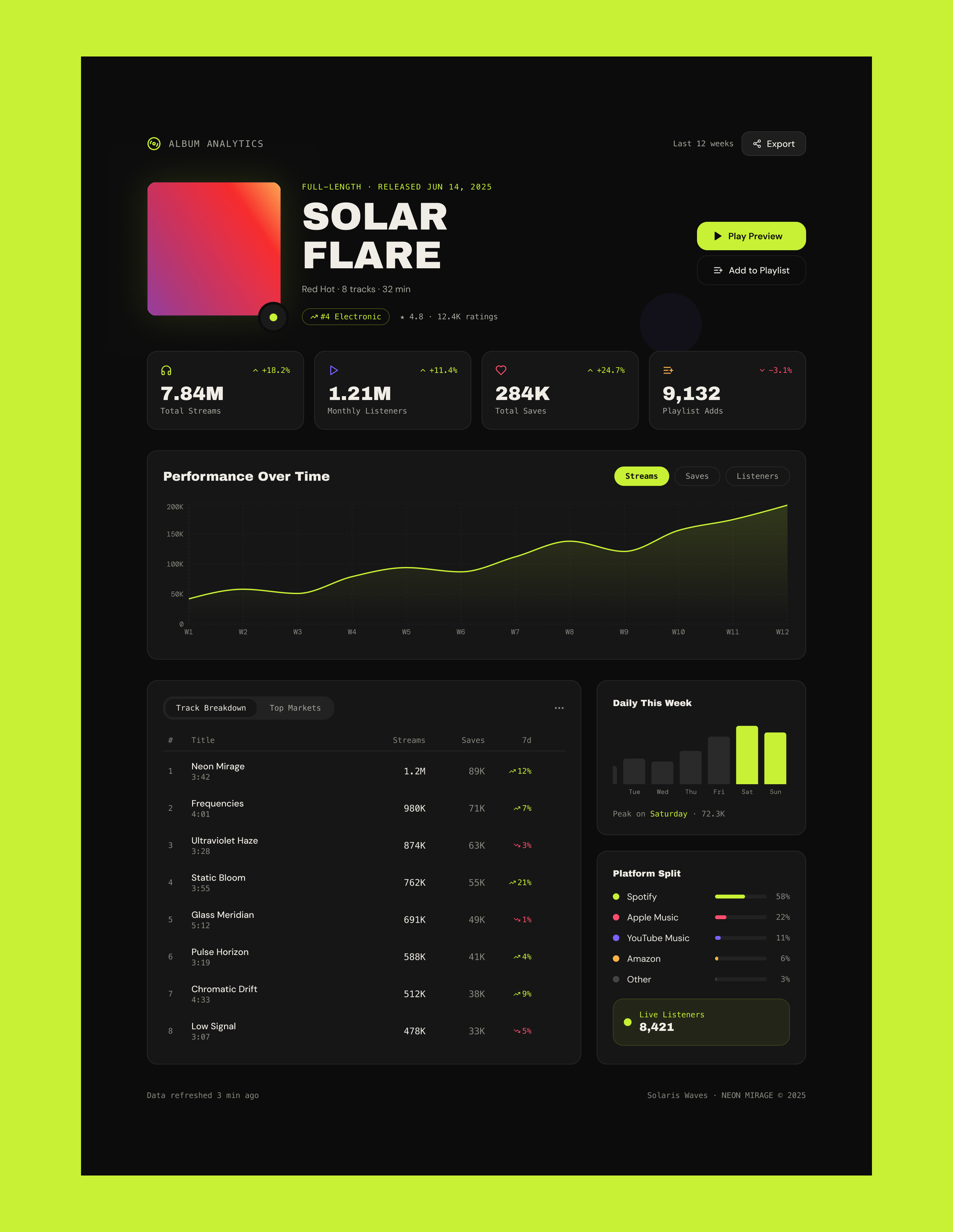
The final interface pairs high-density data visualization with instant metric toggling. Selecting primary KPIs dynamically re-renders the central velocity chart, colorways, and contextual tables to reveal actionable growth signals in seconds.
①
Cross-Platform Parity
Structured release metadata, cover art, and quick actions into a prominent hero module that surfaces genre charting, ratings, and release tags at first glance.
②
Album Hero
Configured a four-card metric strip using functional color cues (electric lime for positive momentum, coral for pullbacks) to give immediate directional orientation.
③
Time Series
Built an in-place trend chart that toggles smoothly across Streams, Saves, and Listeners, automatically adjusting axes and colorways without full-page reloads.
BUSINESS & OPERATIONAL IMPACT
Key Takeaways & Impact
KEY DESIGN SUCCESSES
Clarity Through Scannable Signals
Color-coded metric anchors: Assigning distinct brand hues to Streams, Saves, and Listeners lets artists digest performance trends at a glance without deciphering small labels.
Peak day callouts: Highlighting the highest-velocity streaming day directly on the bar chart gives an immediate answer to when promotional pushes actually landed.
In-place chart toggles: Allowing users to switch views on a single dynamic axis keeps the dashboard uncluttered while encouraging fluid exploration.
What I'd do differently
Future Iterations & Edge Cases
Design mobile-first from day one: Artists check numbers on their phones first thing in the morning. Designing desktop first meant solving dense visual layouts before addressing pocket ergonomics.
Map visualizations for market reach: The "Top Markets" data table works, but an interactive map would communicate geographical breakout trends much faster than a list of text rows.
Proactive alert architecture: Dashboards require active logins. Adding automated push notifications (such as sudden +30% spikes or key playlist adds) would deliver high-value moments straight to the artist in real time.
NEXT PERSONAL PROJECT
All Projects→

ALL PROJECTS
CASE STUDY · 2026
Solar Flare — Music Analytics Dashboard and Real-Time Performance Hub
ROLE
Product Design, IA & Design Systems
PLATFORM
Web Dashboard
PROJECT TYPE
Concept Analytics Platform
Raw streaming and performance metrics often stay trapped in fragmented platforms, leaving artists and management teams sorting through disconnected figures instead of acting on them. Without a unified dashboard, identifying breakout playlist momentum and evaluating audience behavior becomes slow, manual work.
Solar Flare transforms complex multi-platform data into actionable, role-based insights. Designed with high-contrast data visualization, customizable chart modules, and granular user permissions, the platform empowers teams to monitor reach, revenue, and retention in real time.
At a glance: Goals
8M+
TARGET STREAM VOLUME
> 20%
SAVE RATE IMPROVEMENT
< 3s
QUERY PERFORMANCE THRESHOLD
CORE HYPOTHESES & DESIGN RATIONALE
Proposed discovery framework and core research hypotheses.
Streaming platforms provide high-level numbers, but fail to deliver the granular, cross-platform signals artists need to decide where to tour, which single to promote, or when to release a follow-up.
Imagine an independent album release, Solar Flare, building momentum across platforms but lacking unified tooling to interpret performance. The raw data exists, but actionable insight remains buried.
5 Artist & Manager Interviews
Questions I Would Ask:
- "Is looking at your streaming numbers actually useful, or does it just stress you out?"
- "What specific data do you actually share with your label or management team each week?"
- "When planning tour stops or single releases, how much is based on data vs. intuition?"
Competitive Landscape Audit
Gaps to Evaluate:
Unified Views: Do any current tools combine streams, saves, and playlist additions into one cohesive dashboard?
Information Architecture: Why do so many analytics platforms struggle with visual hierarchy and scannability?
Export Workflows: How many steps does it take to pull and share a simple performance summary?
Workflow & Journey Mapping
Pain Points to Validate:
Manual Consolidation: How many discrete steps does it take to compile a cross-platform weekly report?
Context Switching: How many hours are lost logging into separate platform dashboards each release cycle?
Data Discrepancies: Where do artists and managers encounter the most confusion when reconciling mismatched metrics?
Design question
"How might we give independent artists a single, at-a-glance view of album performance that surfaces both health signals and actionable moments without requiring them to be data analysts?"
Bottom Edge Cases
01
Relative Growth vs. Raw Scale
Hypothesis: Directional momentum provides more context than raw totals. A +18% weekly jump tells a clearer performance story than 784M total streams.
Design Rationale: Anchor absolute volume numbers directly against prominent growth deltas.
02
Identifying Temporal Peaks
Hypothesis: Pinpointing specific high-engagement spikes helps artists align social posts, press drops, and playlist pushes effectively.
Design Rationale: Build a daily bar chart featuring automated peak-day callouts within the primary overview.
03
Platform Mental Models
Hypothesis: Data confidence varies by platform. Spotify signals often feel standard, while secondary platforms lack familiar hierarchy.
Design Rationale: Unify platform breakdowns under standardized, high-confidence metric groupings.
04
Context-Aware Exports
Hypothesis: Export requirements split by role. Managers need CSVs, artists share social visual cards, and labels expect structured PDFs.
Design Rationale: Provide targeted export formats tailored to who receives the report.
INFORMATION ARCHITECTURE: USER FLOW
End-to-end dashboard interaction flow
Mapping the core user journey from initial authentication to actionable reporting, highlighting modular exploration paths and key logic rules.
A
Authenticate
Role-based login
B
Album Overview
High-level
health signals
C
Inspect Metric
Deep-dive drawer
D
Filter Scope
Time range
& platform
E
Track Breakdown
Per-song performance
F
Market View
Geographic distribution
G
Export Report
Targeted
stakeholder assets
Screen Elements: Album Overview
- Dynamic album art and release metadata
- Four primary KPI trend cards (Streams, Saves, Playlist Reach, Velocity)
- Quick-action triggers (Share Summary, Play Preview, Filter Release)
Dynamic Priority Logic
Dynamically evaluate 7-day velocity deltas across all tracks; surface the highest-accelerating metric as the primary header takeaway.
VISUAL DESIGN: IOS MOBILE EXPERIENCE
Iterative wireframing: Establishing layout hierarchy
Three structural iterations exploring information density and visual balance before moving into high-fidelity design.
Hybrid final
Blends an expressive media header, scannable metric pills, an expansive full-width trajectory chart, and tabbed granular track breakdowns below. This hierarchy provides high-level health signals in seconds while keeping tactical data accessible.
Expand your browser to see the full wires!
DESIGN SYSTEM: FOUNDATIONS
Accessible dark-mode tokens and high-contrast typographic hierarchy
A focused component system built for high-density music telemetry. It balances deep surface layers, WCAG-compliant neutral text tokens, and electric accent signals to guide glanceable performance monitoring across complex datasets.
--bg
#0a0a0a
Canvas background
--surface
#141414
Elevated container
--card
#1a1a1a
Interactive modules
--lime
#c8f135
Primary trigger / positive
--text
#f0ede6
Primary text
--muted
#a8a8a0
Muted text
--dim
#555550
Dim / captions
--purple
#7b61ff
Listeners metric
--coral
#ff4d6d
Saves metric / neg delta
--amber
#ffb347
Playlist metric
Display
SOLAR FLARE
Heading 1
Performance Over Time
Body medium
Neon Mirage · 3:42
Body regular
Red Hot · 8 tracks · 32 min
Data mono
7.84M +18.2% W12
Tag / badge
FULL-LENGTH · RELEASED JUN 14, 2025
Primary CTA
Default
▶
Play Preview
Hover
▶
Play Preview
Active
▶
Play Preview
Disabled
▶
Play Preview
Loading
· · ·
Ghost / secondary
Default

Add to Playlist
Hover
Add to Playlist
Active
Add to Playlist
Disabled

Add to Playlist
Pill / filter tab
Selected
Streams
Unselected
Saves
Hover
Listeners
Utility / icon button
Default
⬆
Export
Hover
⬆
Export
Active
⬆
Export
Default
View all tracks →
Hover
View all tracks →
Active / pressed
View all tracks →
Visited
View all tracks →
Focus
View all tracks →
KPI card · anatomy
+18.2%
7.84M
Total Streams
Badges & tags
● LIVE
#4 Electronic
Released Jun 14
FULL-LENGTH
→ +18.2%
★ 4.8 · 12.4K ratings
↓ -3.1%
Tab / segmented control
Track Breakdown
Top Markets
Audience Split
Active: Track Breakdown
States
Selected
Tab
Default
Tab
Hover
Tab
export button
⬆
Export
State: default
Hover: subtle border glow.
Click: pulses lime confirmation for 1.2s before settling back to default state.
HIGH-FIDELITY INTERACTION: WEB DASHBOARD
Real-time performance views and dynamic metric inspection
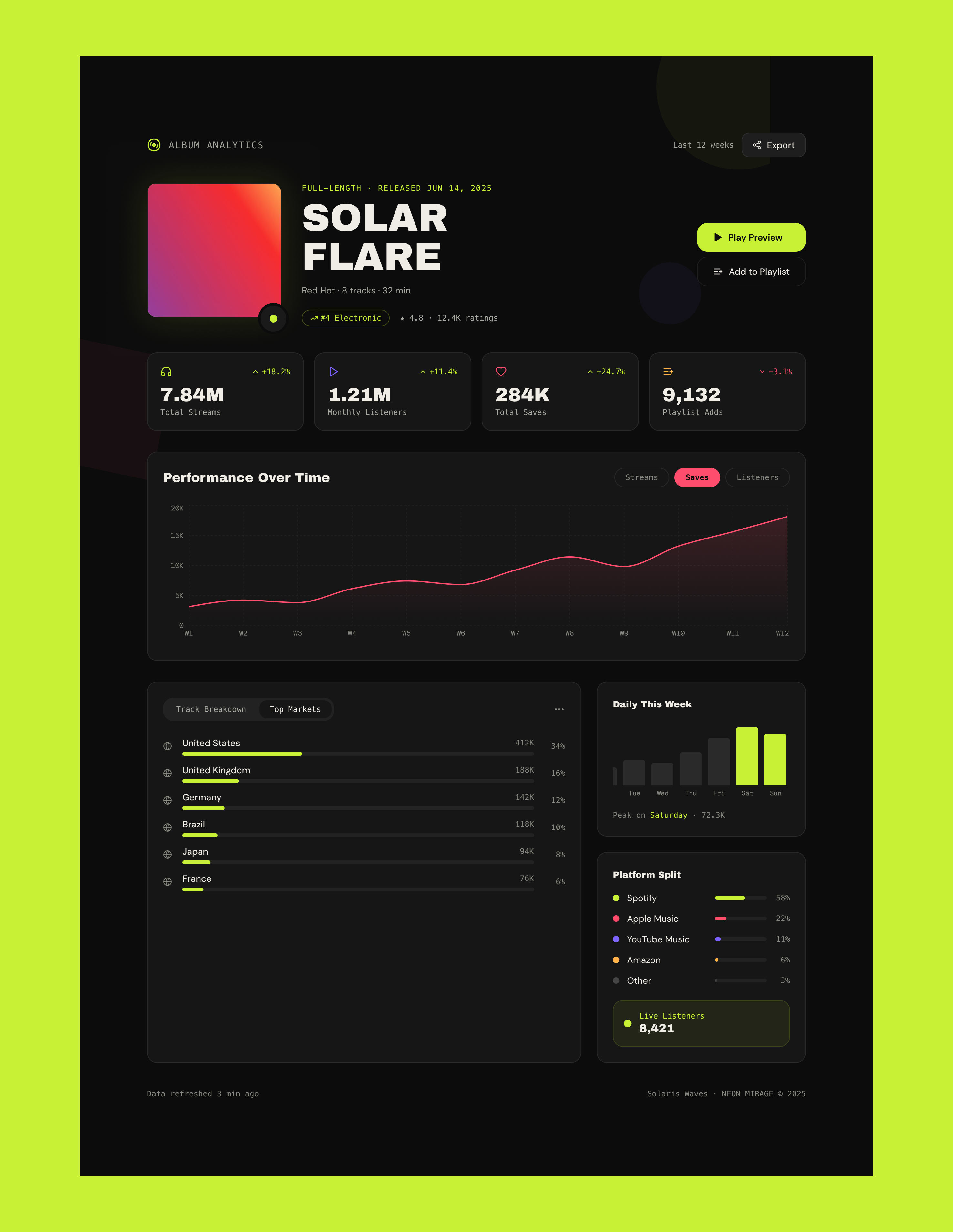
The final interface pairs high-density data visualization with instant metric toggling. Selecting primary KPIs dynamically re-renders the central velocity chart, colorways, and contextual tables to reveal actionable growth signals in seconds.
①
Album Hero
Structured release metadata, cover art, and quick actions into a prominent hero module that surfaces genre charting, ratings, and release tags at first glance.
②
KPI Strip
Configured a four-card metric strip using functional color cues (electric lime for positive momentum, coral for pullbacks) to give immediate directional orientation.
③
Time Series
Built an in-place trend chart that toggles smoothly across Streams, Saves, and Listeners, automatically adjusting axes and colorways without full-page reloads.
PROJECT RETROSPECTIVE & TAKEAWAYS
Target outcomes and self-reflection
KEY DESIGN SUCCESSES
Clarity Through Scannable Signals
Color-coded metric anchors: Assigning distinct brand hues to Streams, Saves, and Listeners lets artists digest performance trends at a glance without deciphering small labels.
Peak day callouts: Highlighting the highest-velocity streaming day directly on the bar chart gives an immediate answer to when promotional pushes actually landed.
In-place chart toggles: Allowing users to switch views on a single dynamic axis keeps the dashboard uncluttered while encouraging fluid exploration.
What I'd do differently
Future Iterations & Edge Cases
Design mobile-first from day one: Artists check numbers on their phones first thing in the morning. Designing desktop first meant solving dense visual layouts before addressing pocket ergonomics.
Map visualizations for market reach: The "Top Markets" data table works, but an interactive map would communicate geographical breakout trends much faster than a list of text rows.
Proactive alert architecture: Dashboards require active logins. Adding automated push notifications (such as sudden +30% spikes or key playlist adds) would deliver high-value moments straight to the artist in real time.
NEXT PERSONAL PROJECT
All Projects→

Sheila Sczepanik
Senior Product Designer
Specializing in enterprise tools, multi-brand design systems, and complex data-dense workflows that scale effortlessly for engineering teams.
ALL PROJECTS
CASE STUDY · 2026
Solar Flare — Music Analytics Dashboard and Real-Time Performance Hub
ROLE
Product Design, IA & Design Systems
PLATFORM
Web Dashboard
PROJECT TYPE
Concept Analytics Platform
Raw streaming and performance metrics often stay trapped in fragmented platforms, leaving artists and management teams sorting through disconnected figures instead of acting on them. Without a unified dashboard, identifying breakout playlist momentum and evaluating audience behavior becomes slow, manual work.
Solar Flare transforms complex multi-platform data into actionable, role-based insights. Designed with high-contrast data visualization, customizable chart modules, and granular user permissions, the platform empowers teams to monitor reach, revenue, and retention in real time.
At a glance: Goals
8M+
TARGET STREAM VOLUME
> 20%
SAVE RATE IMPROVEMENT
< 3s
QUERY PERFORMANCE THRESHOLD
CORE HYPOTHESES & DESIGN RATIONALE
Proposed discovery framework and core research hypotheses.
Streaming platforms provide high-level numbers, but fail to deliver the granular, cross-platform signals artists need to decide where to tour, which single to promote, or when to release a follow-up.
Imagine an independent album release, Solar Flare, building momentum across platforms but lacking unified tooling to interpret performance. The raw data exists, but actionable insight remains buried.
5 Artist & Manager Interviews
Questions I Would Ask:
- "Is looking at your streaming numbers actually useful, or does it just stress you out?"
- "What specific data do you actually share with your label or management team each week?"
- "When planning tour stops or single releases, how much is based on data vs. intuition?"
Competitive Landscape Audit
Gaps to Evaluate:
Unified Views: Do any current tools combine streams, saves, and playlist additions into one cohesive dashboard?
Information Architecture: Why do so many analytics platforms struggle with visual hierarchy and scannability?
Export Workflows: How many steps does it take to pull and share a simple performance summary?
Workflow & Journey Mapping
Pain Points to Validate:
Manual Consolidation: How many discrete steps does it take to compile a cross-platform weekly report?
Context Switching: How many hours are lost logging into separate platform dashboards each release cycle?
Data Discrepancies: Where do artists and managers encounter the most confusion when reconciling mismatched metrics?
Design question
"How might we give independent artists a single, at-a-glance view of album performance that surfaces both health signals and actionable moments without requiring them to be data analysts?"
Bottom Edge Cases
01
Relative Growth vs. Raw Scale
Hypothesis: Directional momentum provides more context than raw totals. A +18% weekly jump tells a clearer performance story than 784M total streams.
Design Rationale: Anchor absolute volume numbers directly against prominent growth deltas.
02
Identifying Temporal Peaks
Hypothesis: Pinpointing specific high-engagement spikes helps artists align social posts, press drops, and playlist pushes effectively.
Design Rationale: Build a daily bar chart featuring automated peak-day callouts within the primary overview.
03
Platform Mental Models
Hypothesis: Data confidence varies by platform. Spotify signals often feel standard, while secondary platforms lack familiar hierarchy.
Design Rationale: Unify platform breakdowns under standardized, high-confidence metric groupings.
04
Context-Aware Exports
Hypothesis: Export requirements split by role. Managers need CSVs, artists share social visual cards, and labels expect structured PDFs.
Design Rationale: Provide targeted export formats tailored to who receives the report.
INFORMATION ARCHITECTURE: USER FLOW
End-to-end dashboard interaction flow
Mapping the core user journey from initial authentication to actionable reporting, highlighting modular exploration paths and key logic rules.
A
Authenticate
Role-based login
B
Album Overview
High-level
health signals
C
Inspect Metric
Deep-dive drawer
D
Filter Scope
Time range
& platform
E
Track Breakdown
Per-song performance
F
Market View
Geographic distribution
G
Export Report
Targeted
stakeholder assets
Screen Elements: Album Overview
- Dynamic album art and release metadata
- Four primary KPI trend cards (Streams, Saves, Playlist Reach, Velocity)
- Quick-action triggers (Share Summary, Play Preview, Filter Release)
Dynamic Priority Logic
Dynamically evaluate 7-day velocity deltas across all tracks; surface the highest-accelerating metric as the primary header takeaway.
WIREFRAMES & STRUCTURAL ITERATION
Iterative wireframing: Establishing layout hierarchy
Three structural iterations exploring information density and visual balance before moving into high-fidelity design.

NAV · Album Analytics · Last 12w · [Export]

Album Art

Title / Meta / CTAs

[Play Preview] [Add to Playlist]

Streams
Listeners
Saves
Playlists

Performance Over Time ——————————————
W1
W3
W5
W7
W9
W11
W12
v1
KPI prioritization
Established that high-level summary cards must precede historical charts to ensure immediate data orientation before trend analysis.

NAV

Streams 7.84M

Listeners 1.21M
Saves 284K
Playlists 9,132


# Title · Streams · Saves · 7d

v2
The card-centric pitfall
Oversizing individual KPI blocks pushed critical temporal trends below the fold. User testing and review proved the time-series chart needed to anchor the primary viewport, not get buried beneath static metric containers.

NAV

Art

Solar Flare · Meta · Tags · Rating

[▶ Play Preview]

[+ Add to Playlist]

7.84M Streams
1.21M Listeners
284K Saves
9,132 Playlists

Performance Over Time


Track Breakdown | Top Markets

Daily This Week · Platform Split
V3 · SELECTED DIRECTION
Balanced hybrid architecture
Blends an expressive media header, scannable metric pills, an expansive full-width trajectory chart, and tabbed granular track breakdowns below. This hierarchy provides high-level health signals in seconds while keeping tactical data accessible.
hoosierlottery.com/who-we-are/
Page 04
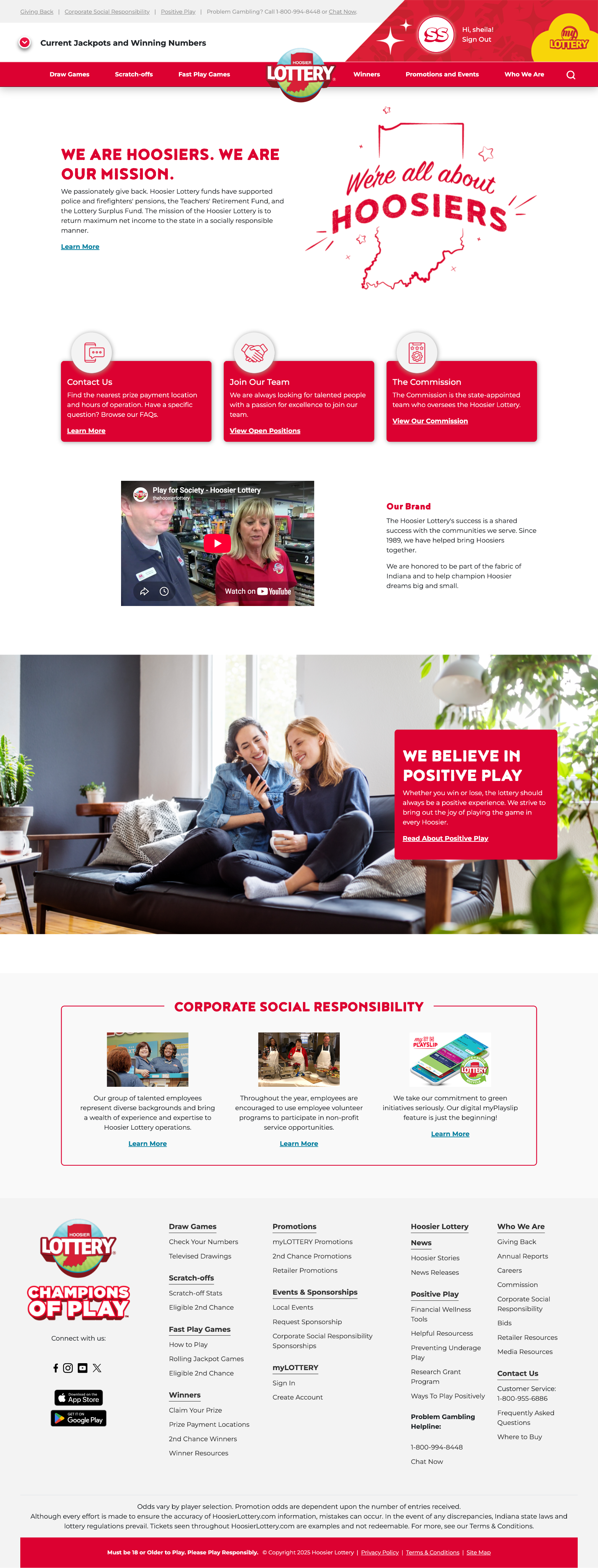
About Us & Giving Back
Dedicated civic trust hub highlighting state pension funding, teacher retirement support, and local community reinvestment.
See Live
DESIGN SYSTEM: FOUNDATIONS
Accessible dark-mode tokens and high-contrast typographic hierarchy
A focused component system built for high-density music telemetry. It balances deep surface layers, WCAG-compliant neutral text tokens, and electric accent signals to guide glanceable performance monitoring across complex datasets.
--bg
#0a0a0a
Canvas background
--surface
#141414
Elevated container
--card
#1a1a1a
Interactive modules
--lime
#c8f135
Primary trigger
--text
#f0ede6
Primary text
--muted
#a8a8a0
Muted text
--dim
#555550
Dim / captions
--purple
#7b61ff
Listeners metric
--coral
#ff4d6d
Saves metric / neg delta
--amber
#ffb347
Playlist metric
Display
SOLAR FLARE
Archivo Black · 56px · Headings
Heading 1
Performance Over Time
Archivo Black · 20px · Section titles
Body medium
Neon Mirage · 3:42
DM Sans 500 · 14px · Track titles, labels
Body regular
Red Hot · 8 tracks · 32 min
DM Sans 400 · 14px · Supporting text
Data mono
7.84M +18.2% W12
DM Mono · 12px · Metrics, labels, axis
Tag / badge
FULL-LENGTH · RELEASED JUN 14, 2025
DM Mono · 11px · Metadata badges
Primary CTA
Default
▶
Play Preview
Hover
▶
Play Preview
Active
▶
Play Preview
Disabled
▶
Play Preview
Loading
· · ·
Ghost / secondary
Default
Add to Playlist
Hover
Add to Playlist
Active
Add to Playlist
Disabled
Add to Playlist
Pill / filter tab
Selected
Streams
Unselected
Saves
Hover
Listeners
Utility / icon button
Default
⬆
Export
Hover
⬆
Export
Active
⬆
Export
Default
View all tracks →
Hover
View all tracks →
Active / pressed
View all tracks →
Visited
View all tracks →
Focus
View all tracks →
KPI card · anatomy
+18.2%
7.84M
Total Streams
Badges & tags
● LIVE
#4 Electronic
Released Jun 14
FULL-LENGTH
→ +18.2%
★ 4.8 · 12.4K ratings
↓ -3.1%
Tab / segmented control
Track Breakdown
Top Markets
Audience Split
Active: Track Breakdown
States
Selected
Tab
Default
Tab
Hover
Tab
export button
⬆
Export
State: default
Hover: subtle border glow.
Click: pulses lime confirmation for 1.2s before settling back to default state.
HIGH-FIDELITY INTERACTION: WEB DASHBOARD
Real-time performance views and dynamic metric inspection
The final interface pairs high-density data visualization with instant metric toggling. Selecting primary KPIs dynamically re-renders the central velocity chart, colorways, and contextual tables to reveal actionable growth signals in seconds.
①
Album Hero
Structured release metadata, cover art, and quick actions into a prominent hero module that surfaces genre charting, ratings, and release tags at first glance.
②
KPI Strip
Configured a four-card metric strip using functional color cues (electric lime for positive momentum, coral for pullbacks) to give immediate directional orientation.
③
Time Series
Built an in-place trend chart that toggles smoothly across Streams, Saves, and Listeners, automatically adjusting axes and colorways without full-page reloads.
PROJECT RETROSPECTIVE & TAKEAWAYS
Target outcomes and self-reflection
KEY DESIGN SUCCESSES
Clarity Through Scannable Signals
Color-coded metric anchors: Assigning distinct brand hues to Streams, Saves, and Listeners lets artists digest performance trends at a glance without deciphering small labels.
Peak day callouts: Highlighting the highest-velocity streaming day directly on the bar chart gives an immediate answer to when promotional pushes actually landed.
In-place chart toggles: Allowing users to switch views on a single dynamic axis keeps the dashboard uncluttered while encouraging fluid exploration.
What I'd do differently
Future Iterations & Edge Cases
Design mobile-first from day one: Artists check numbers on their phones first thing in the morning. Designing desktop first meant solving dense visual layouts before addressing pocket ergonomics.
Map visualizations for market reach: The "Top Markets" data table works, but an interactive map would communicate geographical breakout trends much faster than a list of text rows.
Proactive alert architecture: Dashboards require active logins. Adding automated push notifications (such as sudden +30% spikes or key playlist adds) would deliver high-value moments straight to the artist in real time.
NEXT PERSONAL PROJECT
All Projects→
Sheila Sczepanik
Senior Product Designer
Specializing in enterprise tools, multi-brand design systems, and complex data-dense workflows that scale effortlessly for engineering teams.