
ALL PROJECTS

ALL PROJECTS
CASE STUDY · 2026
ZS Associates — Sheldrick Wildlife Trust: Conservation Storytelling and Visit Scheduling
ROLE
Product Design, IA & Prototyping
PLATFORM
iOS & iPadOS (Figma)
PROJECT TYPE
Passion Project (Concept Redesign)
The Sheldrick Wildlife Trust carries out world-renowned elephant rescue and rehabilitation in Kenya, yet passionate supporters often run into fragmented booking tools and sterile transactional forms. When administrative steps pull focus away from the cause, the emotional bridge between the visitor and the nursery gets lost.
This speculative concept explores how to pair authentic conservation storytelling with an intuitive mobile booking and foster flow, turning a routine visit reservation into lifelong donor support.
At a glance
End-to-end
Cross-functional product teams onboarded
Story-led
EMOTIONAL DONOR ONBOARDING
Frictionless
Faster design-to-engineering delivery velocity
WIREFRAMES & INTERACTION ARCHITECTURE
Laying the structural foundation
IPADOS INTERACTION ARCHITECTURE
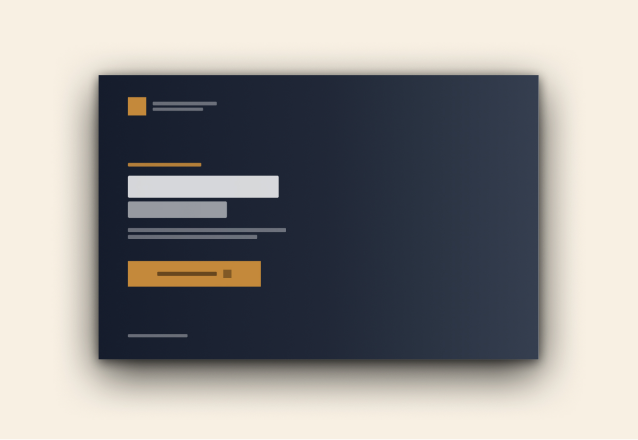
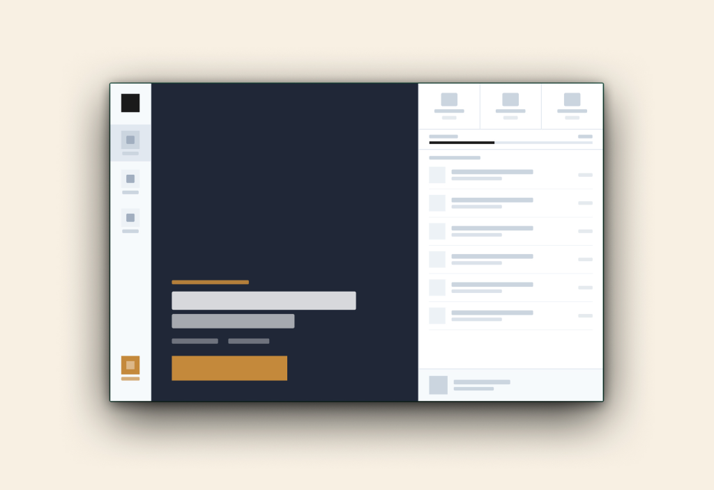
01: Discovery & Visit Overview
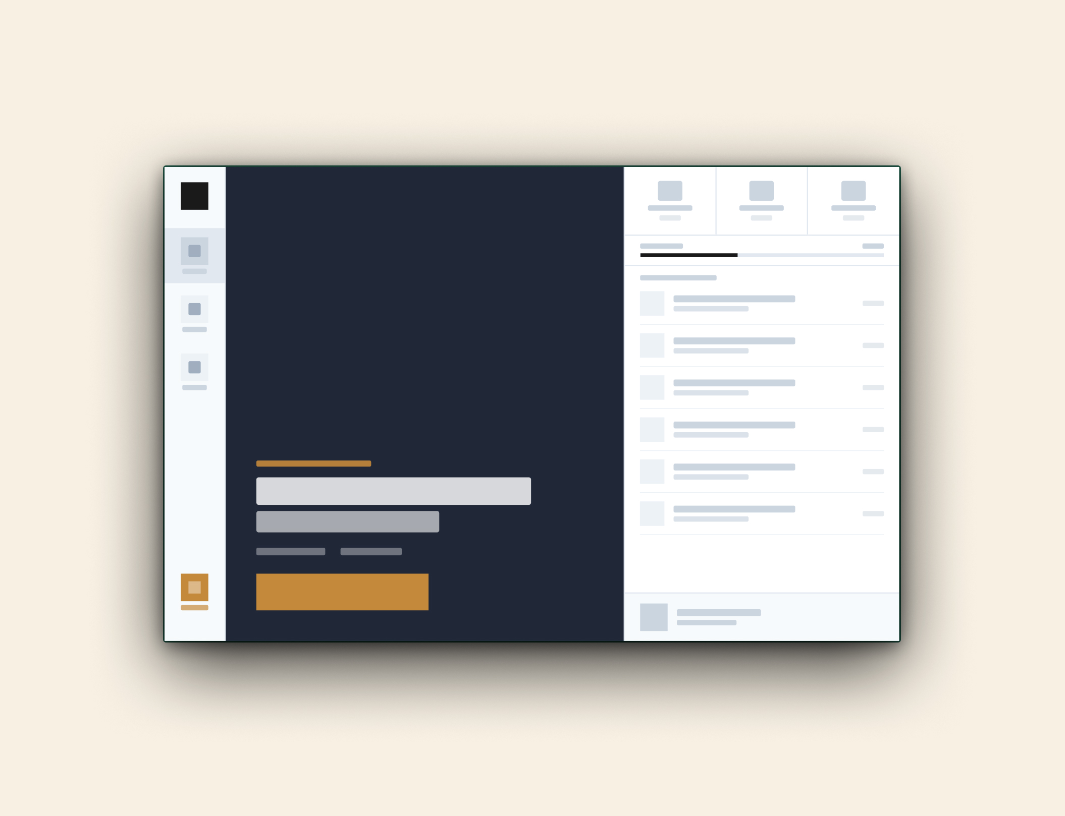
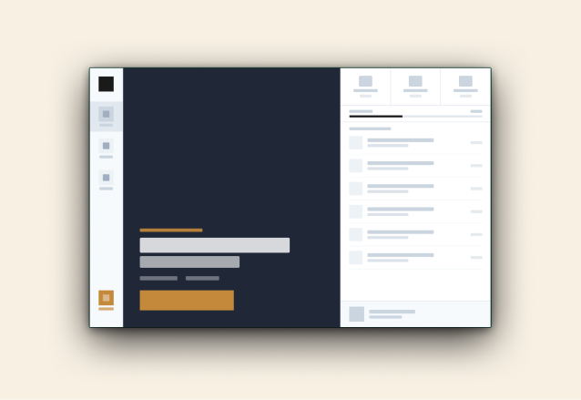
03: Nursery Foster Dashboard
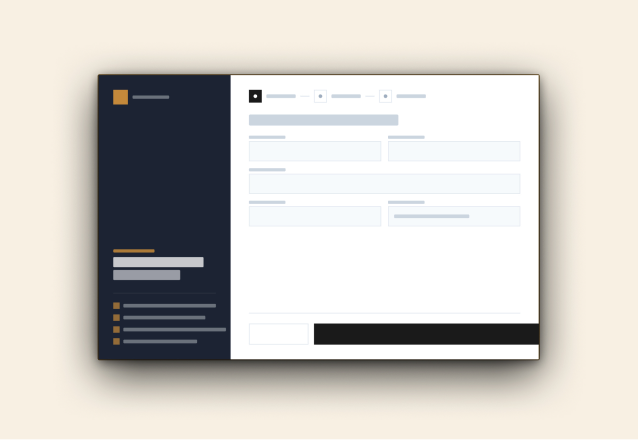
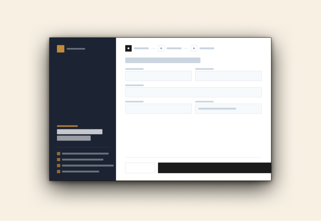
02: Multi-Step Reservation Flow
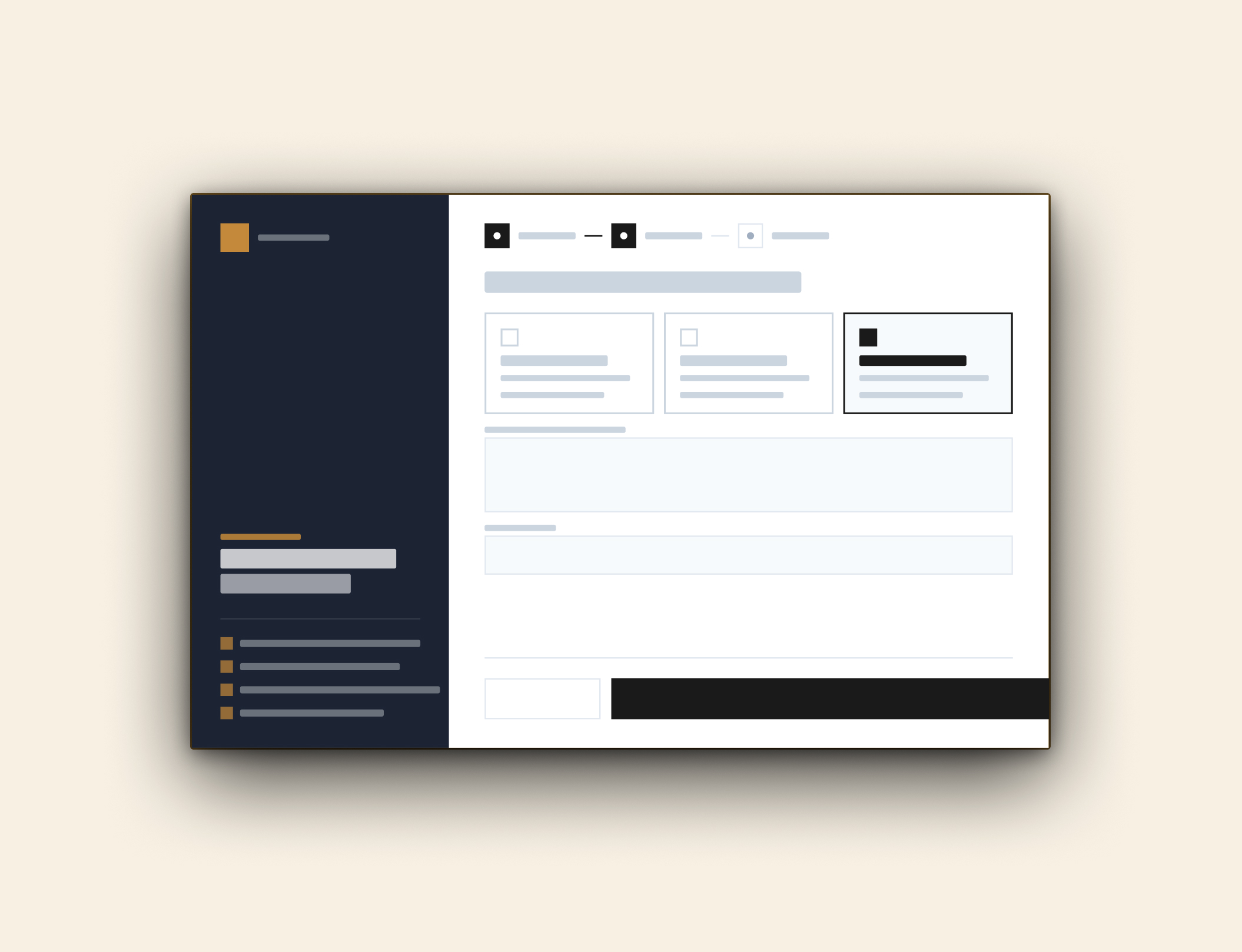
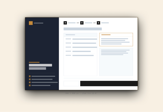
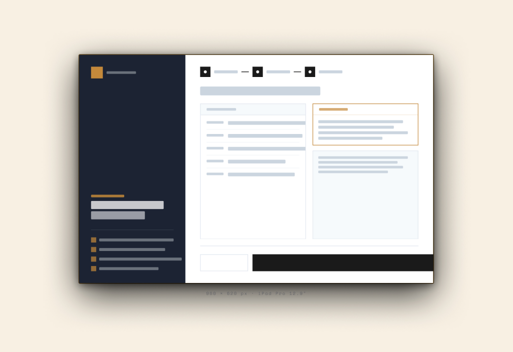
04: Booking Review & Confirmation
VISUAL DESIGN: IPADOS EXPERIENCE
Dual-pane tablet architecture for high-touch booking
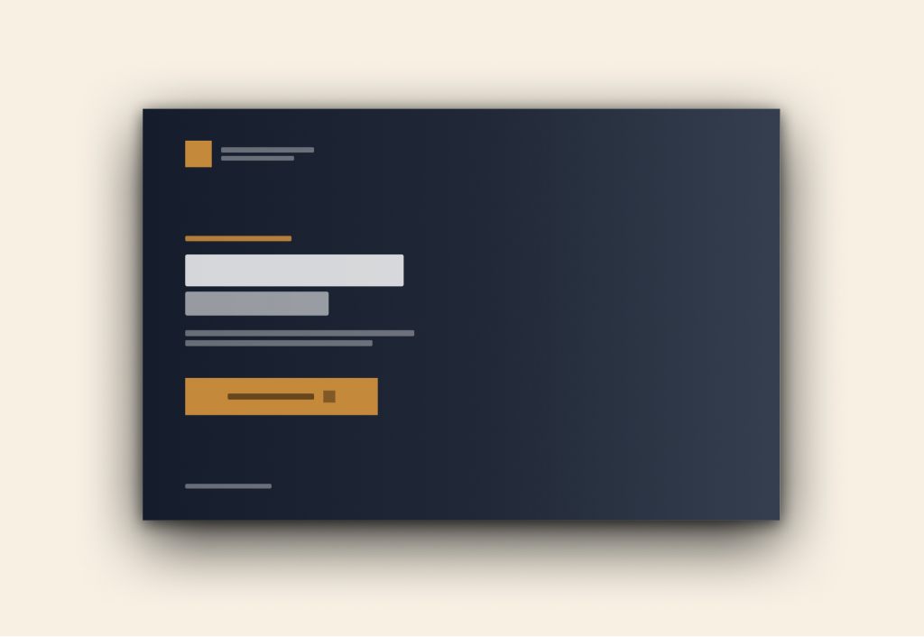
The iPadOS interface uses a persistent split-view layout to balance storytelling with speed. Anchoring event details to the left pane keeps visitors grounded, while progressive inputs on the right minimize input errors through multi-step scheduling.
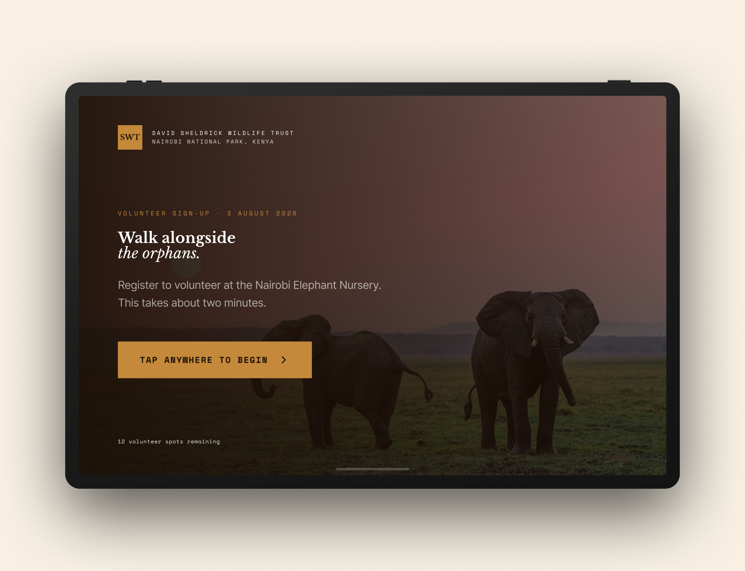
01: Immersive Visitor Onboarding
- Contextual Grounding: Pairs full-bleed conservation imagery with real-time capacity notes so visitors immediately understand timing and availability.
- Frictionless Entry: Highlights clear primary actions with upfront time estimates ("Takes about two minutes") to encourage immediate registration.
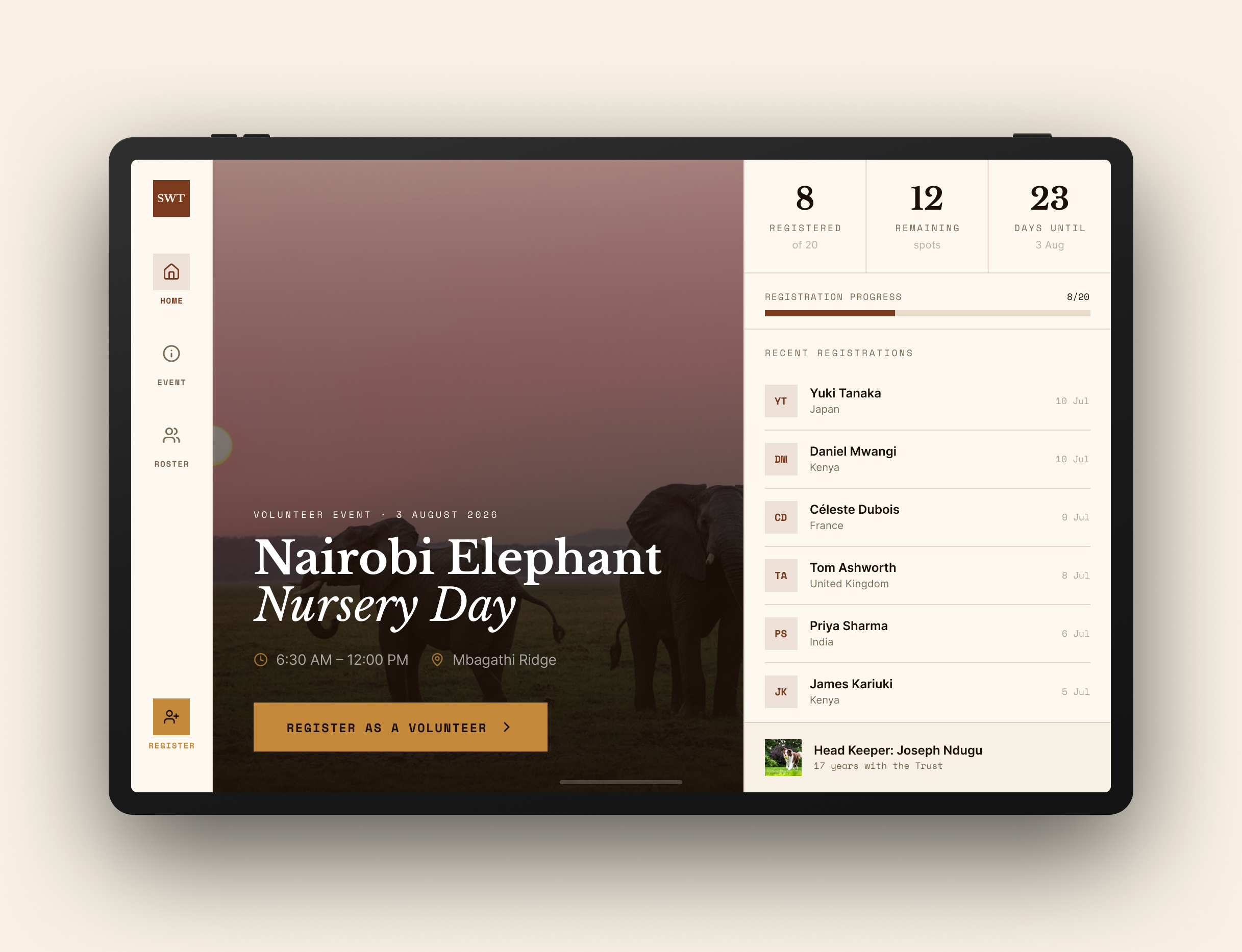
02: Nursery Capacity & Availability Dashboard
- Live Slot Visibility: Surfaces open spots, attendee counts, and upcoming session dates using scannable summary badges.
- Community Validation: Features recent bookings in a side feed to build trust and confirm active session interest before users dive into the form.
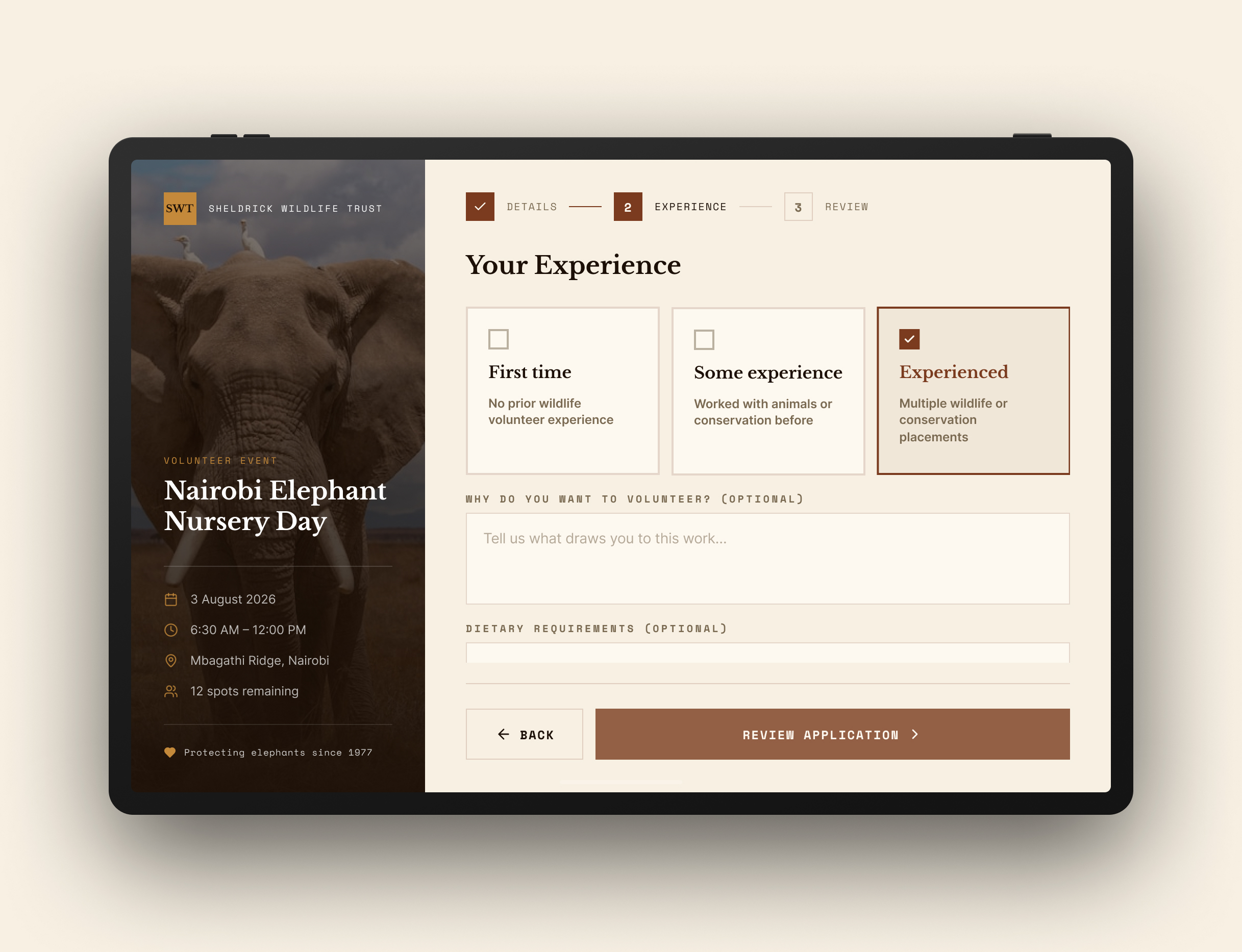
03: Progressive Intake & Context Rail
- Pinned Visit Rail: Locks critical logistics (date, session time, location) on the left so visitors never lose context as they fill out details.
- Chunked Selection: Breaks visitor options like experience level into broad, touch-friendly radio cards to avoid lengthy dropdowns.
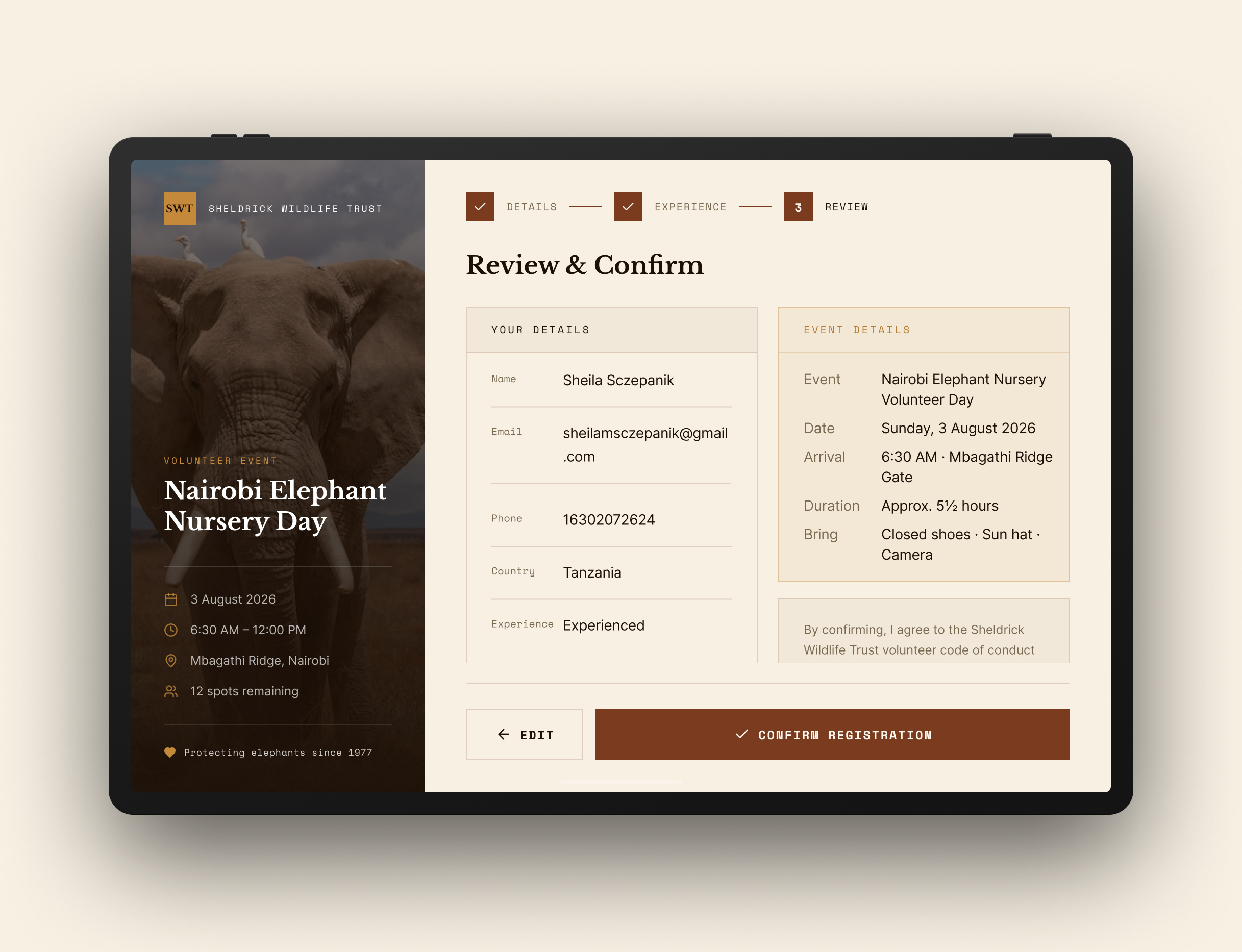
04: STRUCTURED VERIFICATION & CONFIRMATION
- Side-by-Side Review: Places submitted contact details directly opposite booking logistics for a quick final check before confirmation.
- Explicit Modification: Offers clear inline edit paths and direct terms checkboxes to cut down on accidental double-bookings or submission errors.
VISUAL DESIGN: IOS MOBILE EXPERIENCE
Adapting multi-step scheduling to single-column mobile ergonomics
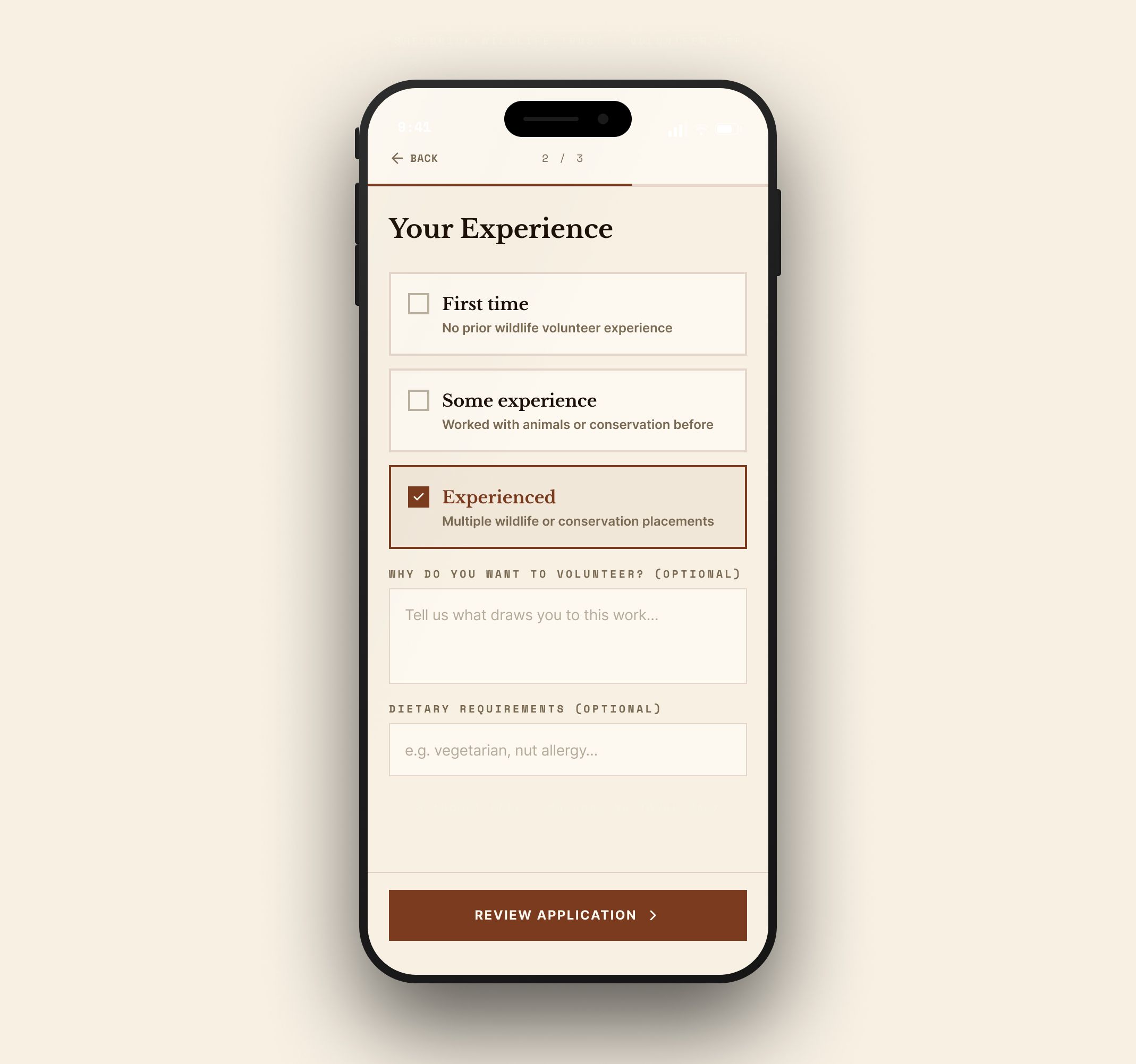
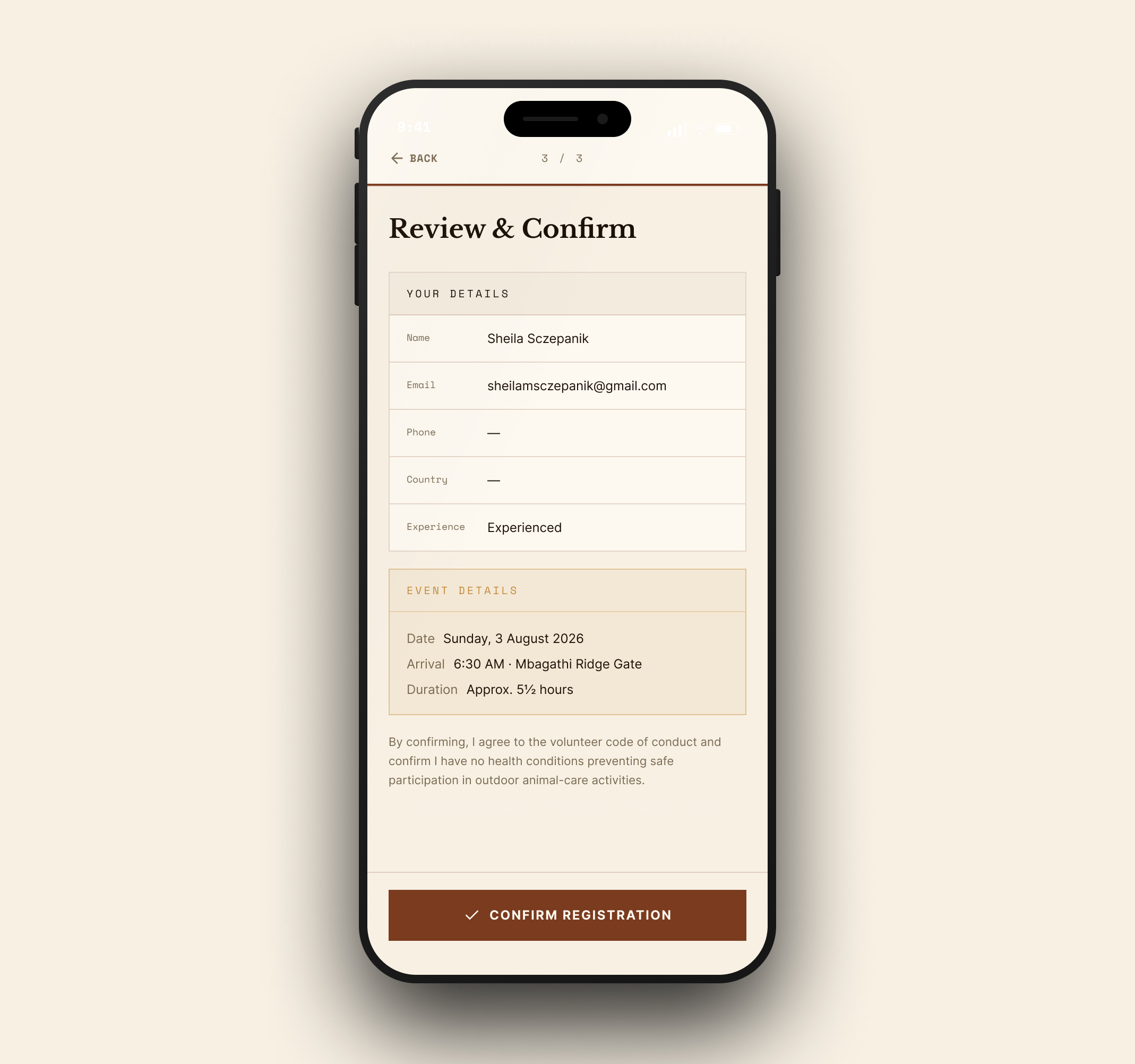
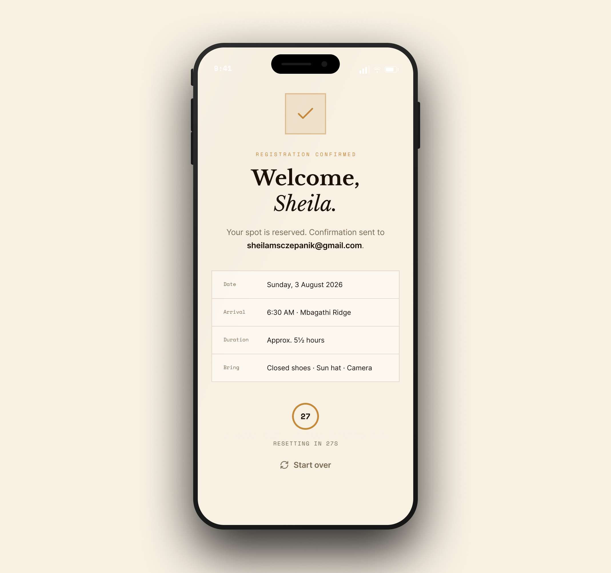
Translating the dual-pane tablet experience to mobile meant stripping away split-screen complexity in favor of a linear, focused path. I prioritized generous touch targets, thumb-zone action bars, and clear screen-by-screen progression to keep one-handed booking effortless.
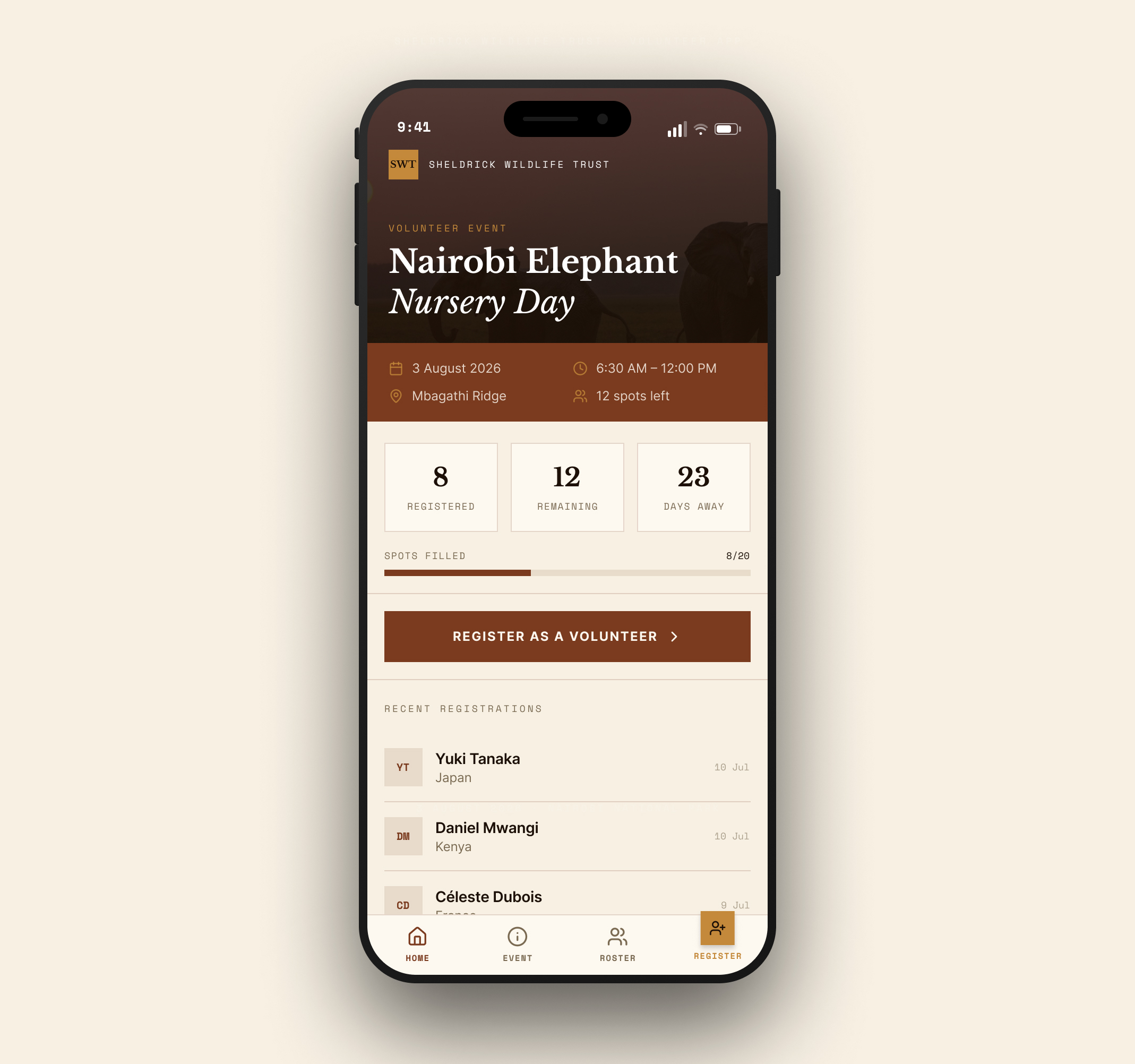
01: Event Logistics & Capacity
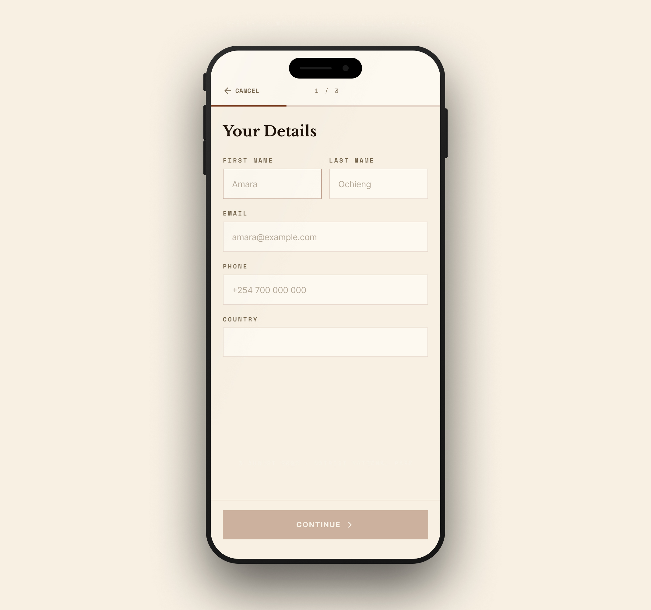
02: Step 1: Contact Details
03: Step 2: Experience Selection
04: Step 3: Summary & Terms
05: Registration Confirmation
Key Mobile Adaptations
- Stacked Context Headers: Collapsed the tablet's persistent left rail into a slim, anchored header card to protect vertical form space on narrow viewports.
- Thumb-Zone Touch Targets: Replaced nested dropdowns with large, selectable cards ($48\+ {px}+$ touch targets) to eliminate precise tapping fatigue and input errors.
- Single-Focus Progression: Divided the checkout into three distinct steps anchored by fixed bottom CTAs, keeping users dialed into one decision at a time.
- Warm Affirmation & Clear State: Built an inviting confirmation screen with instant booking details, calendar sync options, and a natural transition into foster onboarding.
DESIGN SYSTEM: FOUNDATIONS
Accessible color tokens and semantic typographic hierarchy
A lightweight design system grounded in the natural landscape of Nairobi National Park and Tsavo, built around strict WCAG AA contrast pairings and clear typographic roles across iPadOS and iOS viewports.
Nursery Burgundy (#7A3B1E)
Primary interactive CTAs, active focus states, and key narrative accents.
Old Paper (#FDF8F0)
Warm background surface, container cards, and high-readability form canvas.
Keeper Gold (#C4893A)
Secondary accents, progress indicators, and status highlights.
Dust Brown (#7A6A52)
Accessible secondary body copy, borders, and contextual helper text.
Savanna Dark (#1C1007)
Accessible secondary body copy, borders, and contextual helper text.
Display & Headings:
Libre Baskerville
Editorial titles, story intros, and high-emotion confirmation milestones.
UI Controls & Body Copy:
Nunito Sans
Multi-step form inputs, interactive card labels, and scannable interface feedback.
Metadata & Badges:
Jomhuria
Live capacity badges, session timestamps, and status pills.

Balancing emotional resonance with transactional clarity
High-trust conservation platforms succeed when operational transparency meets authentic storytelling. By breaking down a historically cumbersome booking process into focused, respectful interactions across tablet and mobile, this concept demonstrates how non-profits can eliminate administrative friction while building lasting donor loyalty.
NEXT PERSONAL PROJECT
Music Platform→


Sheila Sczepanik
Senior Product Designer
Specializing in enterprise tools, multi-brand design systems, and complex data-dense workflows that scale effortlessly for engineering teams.

ALL PROJECTS
ALL PROJECTS
CASE STUDY · 2026
ZS Associates — Sheldrick Wildlife Trust: Conservation Storytelling and Visit Scheduling
ROLE
Product Design, IA & Prototyping
PLATFORM
iOS & iPadOS (Figma)
PROJECT TYPE
Passion Project (Concept Redesign)
The Sheldrick Wildlife Trust carries out world-renowned elephant rescue and rehabilitation in Kenya, yet passionate supporters often run into fragmented booking tools and sterile transactional forms. When administrative steps pull focus away from the cause, the emotional bridge between the visitor and the nursery gets lost.
This speculative concept explores how to pair authentic conservation storytelling with an intuitive mobile booking and foster flow, turning a routine visit reservation into lifelong donor support.
At a glance
End-to-end
VISITOR & FOSTER MOBILE FLOWS
Story-led
EMOTIONAL DONOR ONBOARDING
Frictionless
NURSERY VISIT SCHEDULING
WIREFRAMES & INTERACTION ARCHITECTURE
Laying the structural foundation
IPADOS INTERACTION ARCHITECTURE
01: Discovery & Visit Overview
03: Nursery Foster Dashboard
02: Multi-Step Reservation Flow
04: Booking Review & Confirmation



3 Aug 2026
6:30 – 12:00


01: Event Overview


STEP 1 OF 3

FIRST NAME

LAST NAME
PHONE
COUNTRY


02: Intake Form


REGISTRATION CONFIRMED
Welcome,
Sheila.


Date

Arrival
Duration
Bring

27
RESETTING IN 27S
03: Confirmation
Key decisions at wire stage
Persistent Context Rails: Pinned critical visit metadata (date, time slot, entry capacity) along the left rail on tablet to eliminate back-and-forth scrolling during checkout.
Progressive Intake: Broken down multi-field guest forms into a focused 3-step sequence (Visitor Info, Foster Matching, Review) to reduce drop-off on mobile.
High-Emotion Confirmation: Swapped generic booking receipt screens for an immediate welcome prompt that encourages same-session foster adoption and calendar sync.
Responsive Dual-Pane Balance: Used iPad screen real estate to keep a live reservation summary visible on the left while forms remain clean and tappable on the right.
VISUAL DESIGN: IPADOS EXPERIENCE
Dual-pane tablet architecture for high-touch booking
The iPadOS interface uses a persistent split-view layout to balance storytelling with speed. Anchoring event details to the left pane keeps visitors grounded, while progressive inputs on the right minimize input errors through multi-step scheduling.
01: Immersive Visitor Onboarding
- Contextual Grounding: Pairs full-bleed conservation imagery with real-time capacity notes so visitors immediately understand timing and availability.
- Frictionless Entry: Highlights clear primary actions with upfront time estimates ("Takes about two minutes") to encourage immediate registration.
02: Nursery Capacity & Availability Dashboard
- Live Slot Visibility: Surfaces open spots, attendee counts, and upcoming session dates using scannable summary badges.
- Community Validation: Features recent bookings in a side feed to build trust and confirm active session interest before users dive into the form.
03: Progressive Intake & Context Rail
- Pinned Visit Rail: Locks critical logistics (date, session time, location) on the left so visitors never lose context as they fill out details.
- Chunked Selection: Breaks visitor options like experience level into broad, touch-friendly radio cards to avoid lengthy dropdowns.
04: STRUCTURED VERIFICATION & CONFIRMATION
- Side-by-Side Review: Places submitted contact details directly opposite booking logistics for a quick final check before confirmation.
- Explicit Modification: Offers clear inline edit paths and direct terms checkboxes to cut down on accidental double-bookings or submission errors.
VISUAL DESIGN: IOS MOBILE EXPERIENCE
Adapting multi-step scheduling to single-column mobile ergonomics
Translating the dual-pane tablet experience to mobile meant stripping away split-screen complexity in favor of a linear, focused path. I prioritized generous touch targets, thumb-zone action bars, and clear screen-by-screen progression to keep one-handed booking effortless.
01: Event Logistics & Capacity
02: Step 1: Contact Details
03: Step 2: Experience Selection
04: Step 3: Summary & Terms
05: Registration Confirmation
Key Mobile Adaptations
- Stacked Context Headers: Collapsed the tablet's persistent left rail into a slim, anchored header card to protect vertical form space on narrow viewports.
- Thumb-Zone Touch Targets: Replaced nested dropdowns with large, selectable cards ($48\+ {px}+$ touch targets) to eliminate precise tapping fatigue and input errors.
- Single-Focus Progression: Divided the checkout into three distinct steps anchored by fixed bottom CTAs, keeping users dialed into one decision at a time.
- Warm Affirmation & Clear State: Built an inviting confirmation screen with instant booking details, calendar sync options, and a natural transition into foster onboarding.
DESIGN SYSTEM: FOUNDATIONS
Accessible color tokens and semantic typographic hierarchy
A lightweight design system grounded in the natural landscape of Nairobi National Park and Tsavo, built around strict WCAG AA contrast pairings and clear typographic roles across iPadOS and iOS viewports.
Nursery Burgundy (#7A3B1E)
Primary interactive CTAs, active focus states, and key narrative accents.
Old Paper (#FDF8F0)
Warm background surface, container cards, and high-readability form canvas.
Keeper Gold (#C4893A)
Secondary accents, progress indicators, and status highlights.
Dust Brown (#7A6A52)
Accessible secondary body copy, borders, and contextual helper text.
Savanna Dark (#1C1007)
Accessible secondary body copy, borders, and contextual helper text.
Display & Headings:
Libre Baskerville
Editorial titles, story intros, and high-emotion confirmation milestones.
UI Controls & Body Copy:
Nunito Sans
Multi-step form inputs, interactive card labels, and scannable interface feedback.
Metadata & Badges:
Jomhuria
Live capacity badges, session timestamps, and status pills.
Balancing emotional resonance with transactional clarity
High-trust conservation platforms succeed when operational transparency meets authentic storytelling. By breaking down a historically cumbersome booking process into focused, respectful interactions across tablet and mobile, this concept demonstrates how non-profits can eliminate administrative friction while building lasting donor loyalty.
NEXT PERSONAL PROJECT
Music Platform→
Sheila Sczepanik
Senior Product Designer
Specializing in enterprise tools, multi-brand design systems, and complex data-dense workflows that scale effortlessly for engineering teams.
ALL PROJECTS
ALL PROJECTS
CASE STUDY · 2026
Sheldrick Wildlife Trust — Conservation Storytelling and Visit Scheduling
ROLE
Product Design, IA & Prototyping
PLATFORM
iOS & iPadOS (Figma)
PROJECT TYPE
Passion Project (Concept Redesign)
The Sheldrick Wildlife Trust carries out world-renowned elephant rescue and rehabilitation in Kenya, yet passionate supporters often run into fragmented booking tools and sterile transactional forms. When administrative steps pull focus away from the cause, the emotional bridge between the visitor and the nursery gets lost.
This speculative concept explores how to pair authentic conservation storytelling with an intuitive mobile booking and foster flow, turning a routine visit reservation into lifelong donor support.
At a glance
End-to-end
VISITOR & FOSTER MOBILE FLOWS
Story-led
EMOTIONAL DONOR ONBOARDING
Frictionless
NURSERY VISIT SCHEDULING
WIREFRAMES & INTERACTION ARCHITECTURE
Laying the structural foundation
IPADOS INTERACTION ARCHITECTURE
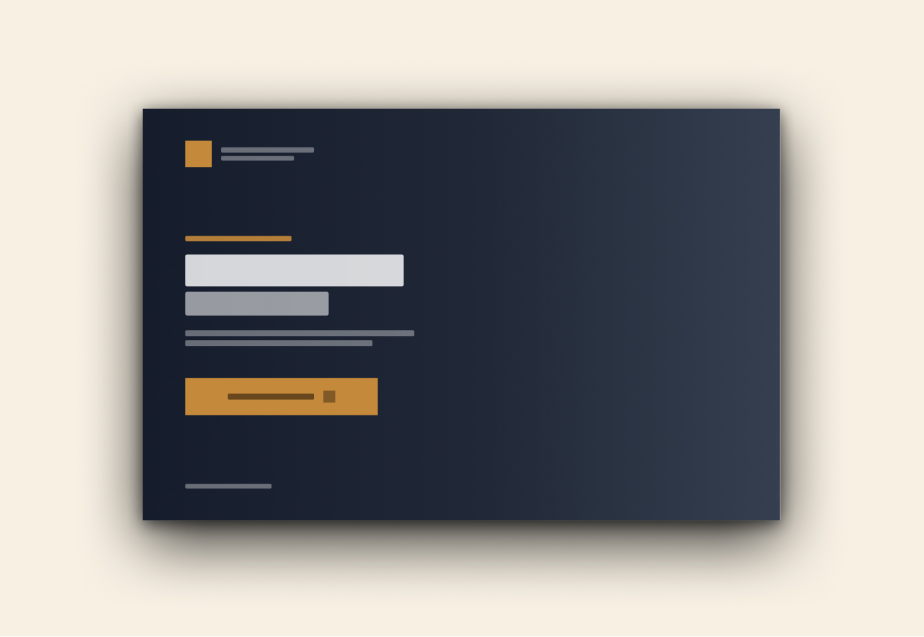
01: Discovery & Visit Overview
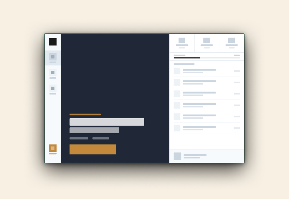
03: Nursery Foster Dashboard
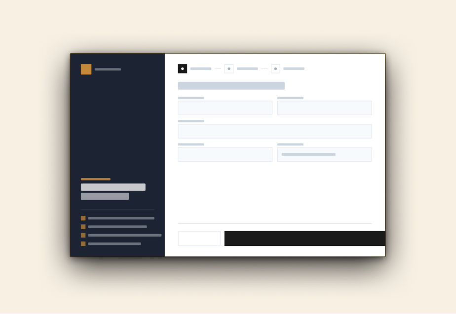
02: Multi-Step Reservation Flow
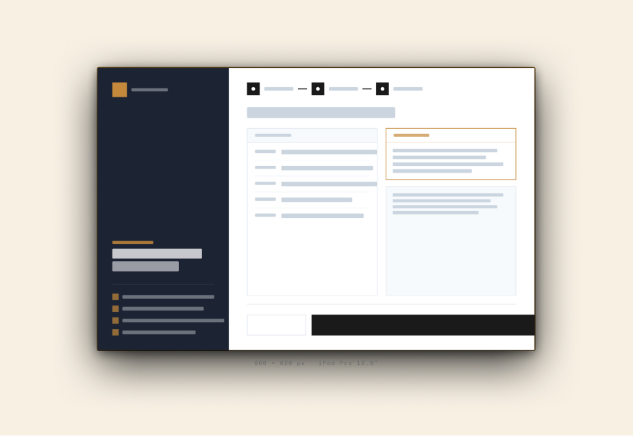
04: Booking Review & Confirmation
3 Aug 2026
6:30 – 12:00
01: Event Overview
STEP 1 OF 3
FIRST NAME
LAST NAME
PHONE
COUNTRY
02: Intake Form
REGISTRATION CONFIRMED
Welcome,
Sheila.
Date
Arrival
Duration
Bring
27
RESETTING IN 27S
03: Confirmation
Key decisions at wire stage
Persistent Context Rails: Pinned critical visit metadata (date, time slot, entry capacity) along the left rail on tablet to eliminate back-and-forth scrolling during checkout.
Progressive Intake: Broken down multi-field guest forms into a focused 3-step sequence (Visitor Info, Foster Matching, Review) to reduce drop-off on mobile.
High-Emotion Confirmation: Swapped generic booking receipt screens for an immediate welcome prompt that encourages same-session foster adoption and calendar sync.
Responsive Dual-Pane Balance: Used iPad screen real estate to keep a live reservation summary visible on the left while forms remain clean and tappable on the right.
VISUAL DESIGN: IPADOS EXPERIENCE
Dual-pane tablet architecture for high-touch booking
The iPadOS interface uses a persistent split-view layout to balance storytelling with speed. Anchoring event details to the left pane keeps visitors grounded, while progressive inputs on the right minimize input errors through multi-step scheduling.
01: Immersive Visitor Onboarding
- Contextual Grounding: Pairs full-bleed conservation imagery with real-time capacity notes so visitors immediately understand timing and availability.
- Frictionless Entry: Highlights clear primary actions with upfront time estimates ("Takes about two minutes") to encourage immediate registration.
02: Nursery Capacity & Availability Dashboard
- Live Slot Visibility: Surfaces open spots, attendee counts, and upcoming session dates using scannable summary badges.
- Community Validation: Features recent bookings in a side feed to build trust and confirm active session interest before users dive into the form.
03: Progressive Intake & Context Rail
- Pinned Visit Rail: Locks critical logistics (date, session time, location) on the left so visitors never lose context as they fill out details.
- Chunked Selection: Breaks visitor options like experience level into broad, touch-friendly radio cards to avoid lengthy dropdowns.
04: STRUCTURED VERIFICATION & CONFIRMATION
- Side-by-Side Review: Places submitted contact details directly opposite booking logistics for a quick final check before confirmation.
- Explicit Modification: Offers clear inline edit paths and direct terms checkboxes to cut down on accidental double-bookings or submission errors.
VISUAL DESIGN: IOS MOBILE EXPERIENCE
Adapting multi-step scheduling to single-column mobile ergonomics
Translating the dual-pane tablet experience to mobile meant stripping away split-screen complexity in favor of a linear, focused path. I prioritized generous touch targets, thumb-zone action bars, and clear screen-by-screen progression to keep one-handed booking effortless.
01: Event Logistics & Capacity
02: Step 1: Contact Details
03: Step 2: Experience Selection
04: Step 3: Summary & Terms
05: Registration Confirmation
Key Mobile Adaptations
- Stacked Context Headers: Collapsed the tablet's persistent left rail into a slim, anchored header card to protect vertical form space on narrow viewports.
- Thumb-Zone Touch Targets: Replaced nested dropdowns with large, selectable cards ($48\+ {px}+$ touch targets) to eliminate precise tapping fatigue and input errors.
- Single-Focus Progression: Divided the checkout into three distinct steps anchored by fixed bottom CTAs, keeping users dialed into one decision at a time.
- Warm Affirmation & Clear State: Built an inviting confirmation screen with instant booking details, calendar sync options, and a natural transition into foster onboarding.
DESIGN SYSTEM: FOUNDATIONS
Accessible color tokens and semantic typographic hierarchy
A lightweight design system grounded in the natural landscape of Nairobi National Park and Tsavo, built around strict WCAG AA contrast pairings and clear typographic roles across iPadOS and iOS viewports.
Nursery Burgundy (#7A3B1E)
Primary interactive CTAs, active focus states, and key narrative accents.
Old Paper (#FDF8F0)
Warm background surface, container cards, and high-readability form canvas.
Keeper Gold (#C4893A)
Secondary accents, progress indicators, and status highlights.
Dust Brown (#7A6A52)
Accessible secondary body copy, borders, and contextual helper text.
Savanna Dark (#1C1007)
Accessible secondary body copy, borders, and contextual helper text.
Display & Headings:
Libre Baskerville
Editorial titles, story intros, and high-emotion confirmation milestones.
UI Controls & Body Copy:
Nunito Sans
Multi-step form inputs, interactive card labels, and scannable interface feedback.
Metadata & Badges:
Jomhuria
Live capacity badges, session timestamps, and status pills.
Balancing emotional resonance with transactional clarity
High-trust conservation platforms succeed when operational transparency meets authentic storytelling. By breaking down a historically cumbersome booking process into focused, respectful interactions across tablet and mobile, this concept demonstrates how non-profits can eliminate administrative friction while building lasting donor loyalty.
NEXT PERSONAL PROJECT
Music Platform→